 ترتیبی که روکسو برای مطالعهی دروس سری CSS پیشرفته
توصیه میکند:
ترتیبی که روکسو برای مطالعهی دروس سری CSS پیشرفته
توصیه میکند:
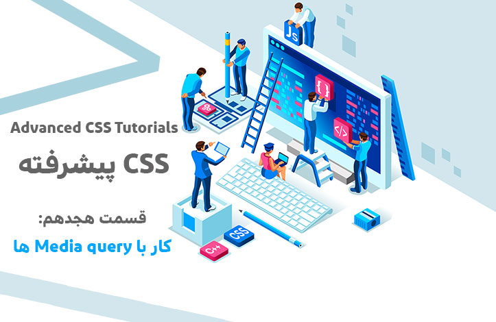
کار با Media Query ها در CSS 3 به همراه چند مثال
11 تیر 1398
 درس 18 از سری CSS پیشرفته
دوستان و همراهان عزیز روکسو، امروز و در این درس از سری آموزشی CSS پیشرفته با آموزش media query در css در خدمت شما عزیزان هستیم.
Media Query چیست؟
دستور media@ در CSS2 معرفی شد و ما را قادر ساخت که بر اساس نوع media استایل های مختلفی تعیین کنیم. به طور مثال می توانستیم برای صفحات کامپیوترها استایل های خاص و برای پرینترها استایل های خاص و برای تلفن های همراه یا تلویزیون ها و موارد بسیار دیگر استایل های خاص خودشان را تعریف کنیم. متاسفانه هیچ گاه از این media type ها به صورت گسترده پشتیبانی نشد (به غیر از حالت print).
بعدها در CSS3 به جای Media Type ها ویژگی جدیدی به نام Media Query ایجاد شد که در واقع دنباله ی همان Media Type ها بودند؛ Media Query ها به جای آنکه نوع دستگاه را بررسی کنند، قابلیت های آن را بررسی می کردند.
Media Query ها می توانند موارد بسیار زیادی را بررسی کنند که چند مورد آن ها را در لیست پایین می بینید:
- عرض و ارتفاع viewport
- عرض و ارتفاع دستگاه
- orientation (گوشی یا تبلت را در حالت افقی (landscape) نگه داشته اید یا عمودی(portrait))
وضعیت پشتیبانی از Media Query ها به شرح زیر است:
| خصوصیت | کروم | Edge | فایرفاکس | سافاری | اپرا |
| media@ | 21.0 | 9.0 | 3.5 | 4.0 | 9.0 |
ساختار استفاده از Media Query ها
Media Quey ها از یک media type به همراه یک یا چند دستور دیگر تشکیل شده اند که در آخر به true یا false می رسند:
@media not|only mediatype and (expressions) {
  CSS-Code;
}
زمانی که media type و دستورات داخل پرانتز (expression ها) همگی برای دستگاهی که سند را باز کرده، صحیح باشند آنگاه کدهای داخلش اجرا می شوند. این اتفاق همیشه انجام می شود مگر اینکه از اپراتورهای not یا or استفاده کنید؛ آنگاه اجرای آن Media Query دلخواه خواهد بود. شما می توانید فایل های CSS را نیز با استفاده از Media Query ها وارد سند HTML خود کنید. مثال:
<link rel="stylesheet" media="mediatype and|not|only (expressions)" href="print.css">
سوالی که پیش می آید این است که Media Type ها چند نوع هستند. پاسخ این سوال در جدول زیر مشخص می شود:
| Media Type | توضیحات |
| all | شامل تمام دستگاه ها می شود. |
| مخصوص پرینتر ها است. | |
| screen | برای صفحات کامپیوتر، موبایل، تبلت و ... است. |
| speech | مخصوص screenreader ها است. |
screenreader دستگاهی است که صفحه ی اینترنت را بلند برای کاربر می خواند. معمولا افراد نابینا یا کم بینا از این تکنولوژی استفاده می کنند.
بهتر است به سراغ مثال های عملی از Media Query برویم.
مثال های مختلف از استفاده ی عملی از Media QUery ها
در کد زیر مشخص کرده ایم که اگر عرض viewport از 480 پیکسل بیشتر یا 480 پیکسل باشد، background-color (رنگ پس زمینه) روشن تر شود اما اگر کمتر از 480 پیکسل باشد پس زمینه صورتی می ماند:
<!DOCTYPE html>
<html>
<head>
<style>
body {
  background-color: pink;
}

@media screen and (min-width: 480px) {
  body {
    background-color: lightgreen;
  }
}
</style>
</head>
<body>

<h1>Resize the browser window to see the effect!</h1>
<p>The media query will only apply if the media type is screen and the viewport is 480px wide or wider.</p>

</body>
</html>
کمی مثال را پیشرفته تر می کنیم! در کد زیر منویی داریم که اگر viewport از 480 پیکسل کمتر باشد به سمت چپ صفحه float می شود، در غیر این صورت همان بالای صفحه می ماند:
<!DOCTYPE html>
<html>
<head>
<meta name="viewport" content="width=device-width, initial-scale=1.0">
<style>
.wrapper {overflow: auto;}

#main {margin-left: 4px;}

#leftsidebar {
  float: none;
  width: auto;
}

#menulist {
  margin: 0;
  padding: 0;
}

.menuitem {
  background: #CDF0F6;
  border: 1px solid #d4d4d4;
  border-radius: 4px;
  list-style-type: none;
  margin: 4px;
  padding: 2px;
}

@media screen and (min-width: 480px) {
  #leftsidebar {width: 200px; float: left;}
  #main {margin-left: 216px;}
}
</style>
</head>
<body>

<div class="wrapper">
  <div id="leftsidebar">
    <ul id="menulist">
      <li class="menuitem">Menu-item 1</li>
      <li class="menuitem">Menu-item 2</li>
      <li class="menuitem">Menu-item 3</li>
      <li class="menuitem">Menu-item 4</li>
      <li class="menuitem">Menu-item 5</li>
    </ul>
  </div>

  <div id="main">
    <h1>Resize the browser window to see the effect!</h1>
    <p>This example shows a menu that will float to the left of the page if the viewport is 480 pixels wide or wider. If the viewport is less than 480 pixels, the menu will be on top of the content.</p>
  </div>
</div>

</body>
</html>
نکته: برای آنکه در این مثال ها متوجه تغییرات شوید باید اندازه ی قسمت خروجی را کوچک تر و بزرگ تر کنید.
در مثال سوم قصد داریم یک منوی واکنش گرا بسازیم که در صورت تغییر سایز صفحه عمودی شود:
<!DOCTYPE html>
<html lang="en">
<head>
<meta charset="utf-8">
<meta name="viewport" content="width=device-width, initial-scale=1">
<style>
* {
  box-sizing: border-box;
}

/* Style the top navigation bar */
.topnav {
  overflow: hidden;
  background-color: #333;
}

/* Style the topnav links */
.topnav a {
  float: left;
  display: block;
  color: #f2f2f2;
  text-align: center;
  padding: 14px 16px;
  text-decoration: none;
}

/* Change color on hover */
.topnav a:hover {
  background-color: #ddd;
  color: black;
}

/* On screens that are 600px wide or less, make the menu links stack on top of each other instead of next to each other */
@media screen and (max-width: 600px) {
  .topnav a {
    float: none;
    width: 100%;
  }
}
</style>
</head>
<body>

<h2>Responsive navigation menu</h2>
<p>Resize the browser window to see the effect: When the screen is less than 600px, the navigation menu will be displayed vertically instead of horizontally.</p>

<div class="topnav">
  <a href="#">Link</a>
  <a href="#">Link</a>
  <a href="#">Link</a>
</div>

</body>
</html>
یکی دیگر از استفاده های رایج از Media Query ها ایجاد قالب های منعطف و چند ستونه است. در مثال زیر قالبی را تعریف کرده ایم که بر اساس سایز صفحه به قالب های چهار قسمتی، دو قسمتی و تکی تقسیم می شود:
<!DOCTYPE html>
<html>
<head>
<meta name="viewport" content="width=device-width, initial-scale=1">
<style>
* {
  box-sizing: border-box;
}

/* Create four equal columns that floats next to each other */
.column {
  float: left;
  width: 25%;
  padding: 20px;
}

/* Clear floats after the columns */
.row:after {
  content: "";
  display: table;
  clear: both;
}

/* On screens that are 992px wide or less, go from four columns to two columns */
@media screen and (max-width: 992px) {
  .column {
    width: 50%;
  }
}

/* On screens that are 600px wide or less, make the columns stack on top of each other instead of next to each other */
@media screen and (max-width: 600px) {
  .column {
    width: 100%;
  }
}
</style>
</head>
<body>

<h2>Responsive Four Column Layout</h2>
<p><strong>Resize the browser window to see the responsive effect.</strong> On screens that are 992px wide or less, the columns will resize from four columns to two columns. On screens that are 600px wide or less, the columns will stack on top of each other instead of next to eachother.</p>

<div class="row">
  <div class="column" style="background-color:#aaa;">
    <h2>Column 1</h2>
    <p>Some text..</p>
  </div>

  <div class="column" style="background-color:#bbb;">
    <h2>Column 2</h2>
    <p>Some text..</p>
  </div>

  <div class="column" style="background-color:#ccc;">
    <h2>Column 3</h2>
    <p>Some text..</p>
  </div>

  <div class="column" style="background-color:#ddd;">
    <h2>Column 4</h2>
    <p>Some text..</p>
  </div>
</div>

</body>
</html>
نکته: روش بسیار بهتری برای ایجاد قالب های منعطف وجود دارد و آن استفاده از Flexbox است. اگر در مورد آن مطلبی نمی دانید به قسمت های قبلی مراجعه کنید. ما مثال بالا را به روش Flexbox نیز پیاده سازی کرده ایم:
<!DOCTYPE html>
<html>
<head>
<meta name="viewport" content="width=device-width, initial-scale=1">
<style>
* {
  box-sizing: border-box;
}

/* Container for flexboxes */
.row {
  display: flex;
  flex-wrap: wrap;
}

/* Create four equal columns */
.column {
  flex: 25%;
  padding: 20px;
}

/* On screens that are 992px wide or less, go from four columns to two columns */
@media screen and (max-width: 992px) {
  .column {
    flex: 50%;
  }
}

/* On screens that are 600px wide or less, make the columns stack on top of each other instead of next to each other */
@media screen and (max-width: 600px) {
  .row {
    flex-direction: column;
  }
}
</style>
</head>
<body>

<h2>Responsive Four Column Layout with Flex</h2>
<p><strong>Resize the browser window to see the responsive effect.</strong> On screens that are 992px wide or less, the columns will resize from four columns to two columns. On screens that are 600px wide or less, the columns will stack on top of each other instead of next to eachother.</p>

<div class="row">
  <div class="column" style="background-color:#aaa;">
    <h2>Column 1</h2>
    <p>Some text..</p>
  </div>

  <div class="column" style="background-color:#bbb;">
    <h2>Column 2</h2>
    <p>Some text..</p>
  </div>

  <div class="column" style="background-color:#ccc;">
    <h2>Column 3</h2>
    <p>Some text..</p>
  </div>

  <div class="column" style="background-color:#ddd;">
    <h2>Column 4</h2>
    <p>Some text..</p>
  </div>
</div>

</body>
</html>
یکی دیگر از استفاده های رایج Media Query ها مخفی سازی عناصر است. به طور مثال تصور کنید جدولی دارید که سایز بسیار بزرگی دارد و اطلاعات آنچنان مهمی نیز ندارد، بنابراین می توان آن را برای دستگاه های کوچک مخفی کرد تا مزاحم تجربه ی کاربری نشود:
<!DOCTYPE html>
<html>
<head>
<meta name="viewport" content="width=device-width, initial-scale=1">
<style>
div.example {
  background-color: yellow;
  padding: 20px;
}

@media screen and (max-width: 600px) {
  div.example {
    display: none;
  }
}
</style>
</head>
<body>

<h2>Hide elements on different screen sizes</h2>

<div class="example">Example DIV.</div>

<p>When the browser's width is 600px wide or less, hide the div element. Resize the browser window to see the effect.</p>

</body>
</html>
همچنین در طراحی های واکنش گرا نیاز به تغییر اندازه ی فونت داریم و می توانیم از Media Query ها به عنوان یکی از روش های آن استفاده کنیم:
<!DOCTYPE html>
<html>
<head>
<meta name="viewport" content="width=device-width, initial-scale=1">
<style>
div.example {
  background-color: lightgrey;
  padding: 20px;
}

@media screen and (min-width: 600px) {
  div.example {
    font-size: 80px;
  }
}

@media screen and (max-width: 600px) {
  div.example {
    font-size: 30px;
  }
}
</style>
</head>
<body>

<h2>Change the font size of an element on different screen sizes</h2>

<div class="example">Example DIV.</div>

<p>When the browser's width is 600px wide or less, set the font-size of DIV to 30px. When it is 601px or wider, set the font-size to 80px. Resize the browser window to see the effect.</p>

</body>
</html>
در آخر هم می توان به ساخت وب سایت های واکنش گرا با Media Query ها اشاره کرد:
<!DOCTYPE html>
<html>
<head>
<title>Page Title</title>
<meta charset="UTF-8">
<meta name="viewport" content="width=device-width, initial-scale=1">
<style>
* {
  box-sizing: border-box;
}

/* Style the body */
body {
  font-family: Arial;
  margin: 0;
}

/* Header/logo Title */
.header {
  padding: 60px;
  text-align: center;
  background: #1abc9c;
  color: white;
}

/* Style the top navigation bar */
.navbar {
  display: flex;
  background-color: #333;
}

/* Style the navigation bar links */
.navbar a {
  color: white;
  padding: 14px 20px;
  text-decoration: none;
  text-align: center;
}

/* Change color on hover */
.navbar a:hover {
  background-color: #ddd;
  color: black;
}

/* Column container */
.row {
  display: flex;
  flex-wrap: wrap;
}

/* Create two unequal columns that sits next to each other */
/* Sidebar/left column */
.side {
  flex: 30%;
  background-color: #f1f1f1;
  padding: 20px;
}

/* Main column */
.main {
  flex: 70%;
  background-color: white;
  padding: 20px;
}

/* Fake image, just for this example */
.fakeimg {
  background-color: #aaa;
  width: 100%;
  padding: 20px;
}

/* Footer */
.footer {
  padding: 20px;
  text-align: center;
  background: #ddd;
}

/* Responsive layout - when the screen is less than 700px wide, make the two columns stack on top of each other instead of next to each other */
@media screen and (max-width: 700px) {
  .row, .navbar {
    flex-direction: column;
  }
}
</style>
</head>
<body>

<!-- Note -->
<div style="background:yellow;padding:5px">
  <h4 style="text-align:center">Resize the browser window to see the responsive effect.</h4>
</div>

<!-- Header -->
<div class="header">
  <h1>My Website</h1>
  <p>With a <b>flexible</b> layout.</p>
</div>

<!-- Navigation Bar -->
<div class="navbar">
  <a href="#">Link</a>
  <a href="#">Link</a>
  <a href="#">Link</a>
  <a href="#">Link</a>
</div>

<!-- The flexible grid (content) -->
<div class="row">
  <div class="side">
    <h2>About Me</h2>
    <h5>Photo of me:</h5>
    <div class="fakeimg" style="height:200px;">Image</div>
    <p>Some text about me in culpa qui officia deserunt mollit anim..</p>
    <h3>More Text</h3>
    <p>Lorem ipsum dolor sit ame.</p>
    <div class="fakeimg" style="height:60px;">Image</div><br>
    <div class="fakeimg" style="height:60px;">Image</div><br>
    <div class="fakeimg" style="height:60px;">Image</div>
  </div>
  <div class="main">
    <h2>TITLE HEADING</h2>
    <h5>Title description, Dec 7, 2017</h5>
    <div class="fakeimg" style="height:200px;">Image</div>
    <p>Some text..</p>
    <p>Sunt in culpa qui officia deserunt mollit anim id est laborum consectetur adipiscing elit, sed do eiusmod tempor incididunt ut labore et dolore magna aliqua. Ut enim ad minim veniam, quis nostrud exercitation ullamco.</p>
    <br>
    <h2>TITLE HEADING</h2>
    <h5>Title description, Sep 2, 2017</h5>
    <div class="fakeimg" style="height:200px;">Image</div>
    <p>Some text..</p>
    <p>Sunt in culpa qui officia deserunt mollit anim id est laborum consectetur adipiscing elit, sed do eiusmod tempor incididunt ut labore et dolore magna aliqua. Ut enim ad minim veniam, quis nostrud exercitation ullamco.</p>
  </div>
</div>

<!-- Footer -->
<div class="footer">
  <h2>Footer</h2>
</div>

</body>
</html>
بررسی Orientation
برای بررسی Orientation دستگاه نیز می توان از Media Query ها استفاده کرد. به مثال زیر توجه کنید:
<!DOCTYPE html>
<html>
<head>
<meta name="viewport" content="width=device-width, initial-scale=1.0">
<style>
body {
  background-color: lightgreen;
}

@media only screen and (orientation: landscape) {
  body {
    background-color: lightblue;
  }
}
</style>
</head>
<body>

<p>Resize the browser window. When the width of this document is larger than the height, the background color is "lightblue", otherwise it is "lightgreen".</p>

</body>
</html>
توجه داشته باشید که orientation: landscape یعنی زمانی که عرض صفحه بیشتر از ارتفاعش باشد بنابراین حتی اگر پشت کامپیوتر هستید می توانید با تغییر سایز صفحه تغییرات را مشاهده کنید.
دستورات Min Width و Max Width
max-width به معنای «حداکثر عرض» و min-width به معنای «حداقل عرض» است. تفاوت این دستور ها با width این است که اگر شرط شما 200 پیکسل بودن width باشد یعنی فقط و فقط 200 پیکسل اما اگر max-width بگذارید یعنی 200 پیکسل و کمتر و اگر min-width بگذارید یعنی 200 پیکسل و بیشتر! بنابراین شرط فراگیر تر می شود. در مثال زیر اگر عرض صفحه بین 600 و 900 پیکسل قرار بگیرد، عنصر <div> ظاهر می شود:
<!DOCTYPE html>
<html>
<head>
<meta name="viewport" content="width=device-width, initial-scale=1">
<style>
@media screen and (max-width: 900px) and (min-width: 600px) {
  div.example {
    font-size: 50px;
    padding: 50px;
    border: 8px solid black;
    background: yellow;
  }
}
</style>
</head>
<body>

<h2>Change the appearance of DIV on different screen sizes</h2>

<div class="example">Example DIV.</div>

<p>When the browser's width is between 600 and 900px, change the appearance of DIV.
<strong>Resize the browser window to see the effect</strong>.</p>

</body>
</html>
البته می توانیم این مثال را پیشرفته تر کنیم و با استفاده از علامت ویرگول (در کد زیر معادل «یا» در فارسی) برای به هم چسباندن چند query جدا استفاده کنیم:
<!DOCTYPE html>
<html>
<head>
<meta name="viewport" content="width=device-width, initial-scale=1">
<style>
@media screen and (max-width: 900px) and (min-width: 600px), (min-width: 1100px) {
  div.example{
    font-size: 50px;
    padding: 50px;
    border: 8px solid black;
    background: yellow;
  }
}
</style>
</head>
<body>

<h2>Change the appearance of DIV on different screen sizes</h2>

<div class="example">Example DIV.</div>

<p>When the browser's width is between 600 and 900px OR above 1100px, change the appearance of DIV.
<strong>Resize the browser window to see the effect</strong>.</p>

</body>
</html>
این مثال می گوید اگر عرض صفحه بین 600 و 900 پیکسل بود یا بیشتر از 1100 پیکسل بود ظاهر <div> را تغییر بده!
امیدوارم از درس آموزش media query در css لذت برده باشید.
ترتیبی که روکسو برای مطالعهی دروس سری CSS پیشرفته
توصیه میکند:
دورههای آموزشی مرتبط
مقالات مرتبط
17 اردیبهشت 1401
15 اردیبهشت 1401
11 بهمن 1400
07 اردیبهشت 1400
09 مرداد 1399


در این قسمت، به پرسشهای تخصصی شما دربارهی محتوای مقاله پاسخ داده نمیشود. سوالات خود را اینجا بپرسید.
در این قسمت، به پرسشهای تخصصی شما دربارهی محتوای مقاله پاسخ داده نمیشود. سوالات خود را اینجا بپرسید.