 ترتیبی که روکسو برای مطالعهی دروس سری صفر تا صد CSS
توصیه میکند:
ترتیبی که روکسو برای مطالعهی دروس سری صفر تا صد CSS
توصیه میکند:
انواع position در زبان CSS
08 اردیبهشت 1398
 درس 16 از سری صفر تا صد CSS

position
خصوصیت position نحوه ی موقعیت گیری عناصر در صفحه ی HTML را مشخص می کند و می تواند هر کدام از مقادیر زیر را بگیرد:
staticrelativefixedabsolutesticky
این پنج حالت مختلف رفتار و عکس العمل عنصر مورد نظر را نسبت به دستورات top و bottom و left و right، مشخص می کنند. بیایید تک تک آن ها را بررسی کنیم.
position: static
static در لغت به معنی «ایستا» یا «ساکن» یا همان استاتیک خودمان است! عناصری که مقدار static را داشته باشند، همانطور که از نامشان می توان حدس زد، نسبت به دستورات top و bottom و ... بی تفاوت هستند و تغییری نمی کنند. در واقع عنصری که ;position: static است به هیچ شکل خاصی موقعیت دهی نشده است و هر طور که صفحه جا داشته باشد و به او اجازه می دهد در مکان خاصی قرار می گیرد.
به مثال زیر توجه کنید:
<!DOCTYPE html>
<html>
<head>
<style>
div.static {
  position: static;
  border: 3px solid #73AD21;
}
</style>
</head>
<body>

<h2>position: static;</h2>

<p>An element with position: static; is not positioned in any special way; it is
always positioned according to the normal flow of the page:</p>

<div class="static">
  This div element has position: static;
</div>

</body>
</html>
در واقع با چشم عادی و در یک مثال ساده هیچ راهی برای تشخیص عناصر Static وجود ندارد به جز اینکه به کدهای صفحه نگاهی بیندازید!
position: relative
relative در لغت به معنی «نسبی» است. عناصری که به صورت ;position: relative هستند، نسبت به موقعیت عادی خود موقعیت دهی می شوند. بنابراین استفاده از دستورات top, right, bottom, left برای عناصری که از نوع relative هستند، باعث دور شدن این عناصر از موقعیت اصلی شان می شود. به مثال زیر نگاه کنید:
<!DOCTYPE html>
<html>
<head>
<style>
div.relative {
  position: relative;
  left: 30px;
  border: 3px solid #73AD21;
}
</style>
</head>
<body>

<h2>position: relative;</h2>

<p>An element with position: relative; is positioned relative to its normal position:</p>

<div class="relative">
This div element has position: relative;
</div>

</body>
</html>
در این مثال می بینید که عنصر div ما از سمت چپ 30 پیکسل فاصله گرفته است و به همین خاطر کمی جلوتر آمده است! حالا متوجه مفهوم نسبی بودن شدید؟ عنصر ما نسبت به مکان اصلی خود در سمت چپ، 30 پیکسل حرکت کرده است.
position: fixed
fixed در لغت به معنی «ثابت» یا «تثبیت شده» است. همانطور که از نامش حدس می زنید عناصری که از نوع ;position: fixed باشند همیشه در یک قسمت ثابت از صفحه قرار دارند و هیچ گاه از آن حالت خارج نمی شوند. حتی اگر صفحه را اسکرول کنید، این عناصر همراه با اسکرول شما حرکت می کنند و از جایشان تکان نمی خورند.
دستورات top, right, bottom, left نیز برای تعیین موقعیت آن ها در صفحه استفاده می شوند. از آنجایی که عناصر fixed همیشه ثابت هستند، فضایی را در صفحه ی ما اشغال نمی کنند و انگار یک لایه از دیگر عناصر بالاتر هستند. به کد زیر نگاه کنید:
<!DOCTYPE html>
<html>
<head>
<style>
div.fixed {
  position: fixed;
  bottom: 80px;
  right: 5px;
  width: 350px;
  border: 5px solid #73AD21;
}
</style>
</head>
<body>

<h2>position: fixed;</h2>

<p>An element with position: fixed; is positioned relative to the viewport, which means it always stays in the same place even if the page is scrolled:</p>

<p>An element with position: fixed; is positioned relative to the viewport, which means it always stays in the same place even if the page is scrolled:</p>

<p>An element with position: fixed; is positioned relative to the viewport, which means it always stays in the same place even if the page is scrolled:</p>

<p>An element with position: fixed; is positioned relative to the viewport, which means it always stays in the same place even if the page is scrolled:</p>

<p>An element with position: fixed; is positioned relative to the viewport, which means it always stays in the same place even if the page is scrolled:</p>

<p>An element with position: fixed; is positioned relative to the viewport, which means it always stays in the same place even if the page is scrolled:</p>

<p>An element with position: fixed; is positioned relative to the viewport, which means it always stays in the same place even if the page is scrolled:</p>

<p>An element with position: fixed; is positioned relative to the viewport, which means it always stays in the same place even if the page is scrolled:</p>

<p>An element with position: fixed; is positioned relative to the viewport, which means it always stays in the same place even if the page is scrolled:</p>

<p>An element with position: fixed; is positioned relative to the viewport, which means it always stays in the same place even if the page is scrolled:</p>

<p>An element with position: fixed; is positioned relative to the viewport, which means it always stays in the same place even if the page is scrolled:</p>

<p>An element with position: fixed; is positioned relative to the viewport, which means it always stays in the same place even if the page is scrolled:</p>

<p>An element with position: fixed; is positioned relative to the viewport, which means it always stays in the same place even if the page is scrolled:</p>

<p>An element with position: fixed; is positioned relative to the viewport, which means it always stays in the same place even if the page is scrolled:</p>

<p>An element with position: fixed; is positioned relative to the viewport, which means it always stays in the same place even if the page is scrolled:</p>

<div class="fixed">
This div element has position: fixed;
</div>

</body>
</html>
زمانی که وارد صفحه ی خروجی کد بالا شدید متوجه می شوید حتی با اسکرول نیز نمی توانید از شر عنصر div کنار صفحه راحت شوید. این عنصر کاملا در جای خود ثابت است (اضافه کردن پاراگراف های تکراری به این خاطر است که صفحه قابلیت اسکرول داشته باشد).
position: absolute
absolute در لغت به معنی «مطلق» یا «کامل» است. عناصری که از نوع ;position: absolute هستند نسبت به اولین جد/پدرشان موقعیت دهی می شوند. در مورد عناصر fixed این موضوع صادق نبود، چرا که عناصر fixed بر اساس viewport موقعیت دهی می شدند. البته اگر عناصر absolute هیچ پدر یا parent ای نداشته باشند که قبلا positioned نشده باشد (یعنی عنصری که مقدار position آن هر چیزی به غیر از static باشد)، از بدنه ی سند HTML استفاده کرده و با اسکرول پیج حرکت می کنند.
به مثال زیر توجه کنید:
<!DOCTYPE html>
<html>
<head>
<style>
div.relative {
  position: relative;
  width: 400px;
  height: 200px;
  border: 3px solid #73AD21;
}

div.absolute {
  position: absolute;
  top: 80px;
  right: 0;
  width: 200px;
  height: 100px;
  border: 3px solid #73AD21;
}
</style>
</head>
<body>

<h2>position: absolute;</h2>

<p>An element with position: absolute; is positioned relative to the nearest positioned ancestor (instead of positioned relative to the viewport, like fixed):</p>

<div class="relative">This div element has position: relative;
  <div class="absolute">This div element has position: absolute;</div>
</div>

</body>
</html>
همانطور که در خروجی مشاهده می کنید، عنصر ما نسبت به عنصر پدر خود (یعنی عنصری که عنصرِ absolute در آن قرار دارد) موقعیت دهی می شود.
position: sticky
sticky به معنی «چسبنده» است. عناصری که از نوع ;position: sticky باشند بر اساس موقعیت اسکرول بار موقعیت دهی می شوند. در واقع هر عنصر sticky بر اساس حرکت اسکرول بار بین حالت های relative و fixed تغییر می کند؛ در حالت کلی relative است اما زمانی که به یک نقطه ی خاص برسد تبدیل به fixed می شود و سر جایش می چسبد.
نکته: مرورگرهای Internet Explorer و Edge 15 و نسخه های قدیمی تر از موقعیت sticky پشتیبانی نمی کنند.
به مثال زیر توجه کنید:
<!DOCTYPE html>
<html>
<head>
<style>
div.sticky {
  position: -webkit-sticky;
  position: sticky;
  top: 0;
  padding: 5px;
  background-color: #cae8ca;
  border: 2px solid #4CAF50;
}
</style>
</head>
<body>

<p>Try to <b>scroll</b> inside this frame to understand how sticky positioning works.</p>
<p>Note: IE/Edge 15 and earlier versions do not support sticky position.</p>

<div class="sticky">I am sticky!</div>

<div style="padding-bottom:2000px">
  <p>In this example, the sticky element sticks to the top of the page (top: 0), when you reach its scroll position.</p>
  <p>Scroll back up to remove the stickyness.</p>
  <p>Some text to enable scrolling.. Lorem ipsum dolor sit amet, illum definitiones no quo, maluisset concludaturque et eum, altera fabulas ut quo. Atqui causae gloriatur ius te, id agam omnis evertitur eum. Affert laboramus repudiandae nec et. Inciderint efficiantur his ad. Eum no molestiae voluptatibus.</p>
  <p>Some text to enable scrolling.. Lorem ipsum dolor sit amet, illum definitiones no quo, maluisset concludaturque et eum, altera fabulas ut quo. Atqui causae gloriatur ius te, id agam omnis evertitur eum. Affert laboramus repudiandae nec et. Inciderint efficiantur his ad. Eum no molestiae voluptatibus.</p>
</div>

</body>
</html>
همانطور که در خروجی مشاهده می کنید با اسکرول کردن صفحه، موقعیت نوار سبز رنگ نیز تغییر می کند و Fixed می شود.
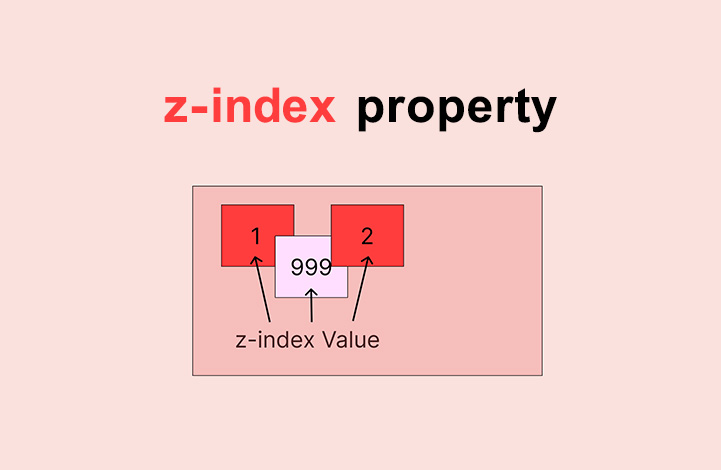
لایه بندی عناصر
برخی اوقات عناصری که موقعیت دهی می شوند ممکن است روی یکدیگر قرار بگیرند. برای آنکه مشخص کنیم کدام عنصر روی کدام قرار بگیرد، یا به عبارتی عنصری که رو قرار می گیرد کدام باشد از خاصیت z-index استفاده میکنیم که می تواند مقادیر مثبت یا منفی بگیرد.
مثال:
<!DOCTYPE html>
<html>
<head>
<style>
img {
  position: absolute;
  left: 0px;
  top: 0px;
  z-index: -1;
}
</style>
</head>
<body>

<h1>This is a heading</h1>
<img src="https://www.roxo.ir/blog-panel/wp-content/uploads/2019/03/roxo-plus-new.png" width="250">
<p>Because the image has a z-index of -1, it will be placed behind the text.</p>

</body>
</html>
هر چقدر مقدار z-index برای عنصری بیشتر باشد، آن عنصر بالاتر خواهد بود و بنابراین روی عناصر دیگر نمایش داده می شود و هر چه مقدار آن کمتر باشد (مثلا منفی باشد) عنصر پایین تر خواهد رفت. در مثال بالا می بینید که لوگوی روکسو z-index کمتری نسبت به متن دارد بنابراین متن روی آن نشان داده می شود.
نکته: اگر دو عنصر روی هم قرار بگیرند و برای هیچ کدام از z-index استفاده نکنیم، عنصری بالاتر قرار می گیرد که در سورس کد HTML پایین تر از بقیه ی عناصر باشد (از نظر اینکه خط چندم باشد). به طور مثال عنصری که در خط 200 اُم سند HTML ما تعریف شده است همیشه روی عنصری خواهد بود که در خط 100 اُم تعریف شده است.
با استفاده از همین قانون می توانیم متون خود را روی تصاویر نیز قرار بدهیم:
<!DOCTYPE html>
<html>
<head>
<style>
.container {
  position: relative;
}

.topright {
  position: absolute;
  top: 8px;
  right: 16px;
  font-size: 18px;
}

img {
  width: 100%;
  height: auto;
  opacity: 0.3;
}
</style>
</head>
<body>

<h2>Image Text</h2>
<p>Add some text to an image in the top right corner:</p>

<div class="container">
  <img src="https://www.w3schools.com/css/img_5terre_wide.jpg" alt="Cinque Terre" width="1000" height="300">
  <div class="topright">Top Right</div>
</div>

</body>
</html>
امیدوارم از این قسمت لذت برده باشید.
ترتیبی که روکسو برای مطالعهی دروس سری صفر تا صد CSS
توصیه میکند:

دورههای آموزشی مرتبط

مقالات مرتبط
17 اردیبهشت 1401
15 اردیبهشت 1401
11 بهمن 1400
07 اردیبهشت 1400
09 مرداد 1399


در این قسمت، به پرسشهای تخصصی شما دربارهی محتوای مقاله پاسخ داده نمیشود. سوالات خود را اینجا بپرسید.
در این قسمت، به پرسشهای تخصصی شما دربارهی محتوای مقاله پاسخ داده نمیشود. سوالات خود را اینجا بپرسید.