 ترتیبی که روکسو برای مطالعهی دروس سری CSS پیشرفته
توصیه میکند:
ترتیبی که روکسو برای مطالعهی دروس سری CSS پیشرفته
توصیه میکند:
آموزش کامل کار با مدل Flexbox (قسمت اول)
10 تیر 1398
 درس 16 از سری CSS پیشرفته
Flexbox در CSS چیست؟
به قسمتی دیگر از سری آموزشی CSS پیشرفته خوش آمدید. باید بدانید که قبل از معرفی Flexbox در css ، چهار حالت مختلف برای نمایش طرح کلی صفحه وجود داشت:
- Block برای قسمت های مختلف یک صفحه
- Inline برای متن ها
- Table (جدول) برای داده های دو بعدی جدول ها
- Positioned برای تعیین موقعیت صریح یک عنصر
اما خاصیت Flexible Box یا به اختصار Flexbox در css ، کار طراحی صفحات واکنش گرا (بدون استفاده از float و ...) را بسیار آسان کرده است. پشتیبانی از این خصوصیت در مرورگرهای مختلف به این شرح است:
| کروم | Edge | فایرفاکس | سافاری | اپرا |
| 29.0 | 11.0 | 22.0 | 10 | 48 |
عناصر Flexbox
برای استفاده از مدل Flexbox باید ابتدا یک نگهدارنده (container) ایجاد کنید. به این مثال توجه کنید:
<!DOCTYPE html>
<html>
<head>
<style>
.flex-container {
  display: flex;
  background-color: DodgerBlue;
}

.flex-container > div {
  background-color: #f1f1f1;
  margin: 10px;
  padding: 20px;
  font-size: 30px;
}
</style>
</head>
<body>

<div class="flex-container">
  <div>1</div>
  <div>2</div>
  <div>3</div>
</div>

<p>A Flexible Layout must have a parent element with the <em>display</em> property set to <em>flex</em>.</p>

<p>Direct child elements(s) of the flexible container automatically becomes flexible items.</p>

</body>
</html>
همانطور که در مثال می بینید برای استفاده از Flexbox باید display را برای عنصر نگهدارنده روی flex تنظیم کنیم. بدین صورت عناصر داخل آن هر کدام یک آیتم flexbox محسوب می شوند.
قبلا هم گفتیم که عنصر نگهدارنده با تنظیم display به flex وارد حالت Flexbox می شود:
.flex-container {
  display: flex;
}
اما این تنها خصوصیت عنصر نگهدارنده (container) نیست. این عنصر دارای خصوصیات زیر نیز می باشد:
- flex-direction
- flex-wrap
- flex-flow
- justify-content
- align-items
- align-content
قصد داریم تک تک این خصوصیات را بررسی کنیم.
خصوصیت flex-direction
خصوصیت flex-direction تعیین می کند که آیتم های درونش چطور کنار هم قرار بگیرند. برای روشن شدن موضوع چند مثال برای شما آورده ایم:
مثال اول - مقدار column آیتم ها را به صورت عمودی روی هم قرار می دهد:
<!DOCTYPE html>
<html>
<head>
<style>
.flex-container {
  display: flex;
  flex-direction: column;
  background-color: DodgerBlue;
}

.flex-container > div {
  background-color: #f1f1f1;
  width: 100px;
  margin: 10px;
  text-align: center;
  line-height: 75px;
  font-size: 30px;
}
</style>
</head>
<body>
<h1>The flex-direction Property</h1>

<p>The "flex-direction: column;" stacks the flex items vertically (from top to bottom):</p>

<div class="flex-container">
  <div>1</div>
  <div>2</div>
  <div>3</div>
</div>

</body>
</html>
مثال دوم- مقدار column-reverse آیتم ها را به صورت عمودی روی هم قرار می دهد اما به صورت برعکس (از آیتم آخر به اول):
<!DOCTYPE html>
<html>
<head>
<style>
.flex-container {
  display: flex;
  flex-direction: column-reverse;
  background-color: DodgerBlue;
}

.flex-container > div {
  background-color: #f1f1f1;
  width: 100px;
  margin: 10px;
  text-align: center;
  line-height: 75px;
  font-size: 30px;
}
</style>
</head>
<body>
<h1>The flex-direction Property</h1>

<p>The "flex-direction: column-reverse;" stacks the flex items vertically (but from bottom to top):</p>

<div class="flex-container">
  <div>1</div>
  <div>2</div>
  <div>3</div>
</div>

</body>
</html>
مثال سوم - مقدار row آیتم ها را به صورت افقی کنار هم قرار می دهد:
<!DOCTYPE html>
<html>
<head>
<style>
.flex-container {
  display: flex;
  flex-direction: row;
  background-color: DodgerBlue;
}

.flex-container > div {
  background-color: #f1f1f1;
  width: 100px;
  margin: 10px;
  text-align: center;
  line-height: 75px;
  font-size: 30px;
}
</style>
</head>
<body>
<h1>The flex-direction Property</h1>

<p>The "flex-direction: row;" stacks the flex items horizontally (from left to right):</p>

<div class="flex-container">
  <div>1</div>
  <div>2</div>
  <div>3</div>
</div>

</body>
</html>
مثال چهارم - مقدار row-reverse آیتم ها را به صورت افقی کنار هم قرار می دهد اما به صورت برعکس (از آیتم آخر به اول):
<!DOCTYPE html>
<html>
<head>
<style>
.flex-container {
  display: flex;
  flex-direction: row-reverse;
  background-color: DodgerBlue;
}

.flex-container > div {
  background-color: #f1f1f1;
  width: 100px;
  margin: 10px;
  text-align: center;
  line-height: 75px;
  font-size: 30px;
}
</style>
</head>
<body>
<h1>The flex-direction Property</h1>

<p>The "flex-direction: row-reverse;" stacks the flex items horizontally (but from right to left):</p>

<div class="flex-container">
  <div>1</div>
  <div>2</div>
  <div>3</div>
</div>

</body>
</html>
خصوصیت flex-wrap
خصوصیت flex-wrap می گوید که آیا آیتم های Flexbox هنگام رسیدن به پایان عرض صفحه به خط بعدی منتقل شوند و یا اندازه شان کوچک تر شود تا همگی در یک خط و کنار هم قرار بگیرند. برای درک بهتر این خصوصیت چند مثال برایتان آورده ایم. سعی کنید در هر خروجی، اندازه ی مرورگر را کوچک تر و بزرگ تر کنید (خط وسط صفحه در JSBin) تا رفتار آیتم ها را ببینید.
مثال اول - مقدار wrap آیتم ها را wrap می کند (با رسیدن به عرض صفحه، به خط بعد منتقل می شوند):
<!DOCTYPE html>
<html>
<head>
<style>
.flex-container {
  display: flex;
  flex-wrap: wrap;
  background-color: DodgerBlue;
}

.flex-container > div {
  background-color: #f1f1f1;
  width: 100px;
  margin: 10px;
  text-align: center;
  line-height: 75px;
  font-size: 30px;
}
</style>
</head>
<body>
<h1>The flex-wrap Property</h1>

<p>The "flex-wrap: wrap;" specifies that the flex items will wrap if necessary:</p>

<div class="flex-container">
  <div>1</div>
  <div>2</div>
  <div>3</div>
  <div>4</div>
  <div>5</div>
  <div>6</div>
  <div>7</div>
  <div>8</div>
  <div>9</div>
  <div>10</div>
  <div>11</div>
  <div>12</div>
</div>

<p>Try resizing the browser window.</p>

</body>
</html>
مثال دوم - مقدار nowrap آیتم ها را wrap نمی کند (آیتم ها کوچک می شوند تا در یک خط جا شوند):
<!DOCTYPE html>
<html>
<head>
<style>
.flex-container {
  display: flex;
  flex-wrap: nowrap;
  background-color: DodgerBlue;
}

.flex-container>div {
  background-color: #f1f1f1;
  width: 100px;
  margin: 10px;
  text-align: center;
  line-height: 75px;
  font-size: 30px;
}
</style>
</head>
<body>
<h1>The flex-wrap Property</h1>

<p>The "flex-wrap: nowrap;" specifies that the flex items will not wrap (this is default):</p>

<div class="flex-container">
  <div>1</div>
  <div>2</div>
  <div>3</div>
  <div>4</div>
  <div>5</div>
  <div>6</div>
  <div>7</div>
  <div>8</div>
  <div>9</div>
  <div>10</div>
  <div>11</div>
  <div>12</div>
</div>

<p>Try resizing the browser window.</p>

</body>
</html>
مثال سوم - مقدار wrap-reverse آیتم ها را wrap می کند (با رسیدن به عرض صفحه، به خط بعد منتقل می شوند) اما به صورت برعکس (از آیتم آخ به اول):
<!DOCTYPE html>
<html>
<head>
<style>
.flex-container {
  display: flex;
  flex-wrap: wrap-reverse;
  background-color: DodgerBlue;
}

.flex-container > div {
  background-color: #f1f1f1;
  width: 100px;
  margin: 10px;
  text-align: center;
  line-height: 75px;
  font-size: 30px;
}
</style>
</head>
<body>
<h1>The flex-wrap Property</h1>

<p>The "flex-wrap: wrap-reverse;" specifies that the flex items will wrap if necessary, in reverse order:</p>

<div class="flex-container">
  <div>1</div>
  <div>2</div>
  <div>3</div>
  <div>4</div>
  <div>5</div>
  <div>6</div>
  <div>7</div>
  <div>8</div>
  <div>9</div>
  <div>10</div>
  <div>11</div>
  <div>12</div>
</div>

<p>Try resizing the browser window.</p>

</body>
</html>
خصوصیت flex-flow
این خصوصیت یک دستور خلاصه برای خصوصیت های flex-direction و flex-wrap می باشد. به مثال های زیر توجه کنید:
<!DOCTYPE html>
<html>
<head>
<style>
.flex-container {
  display: flex;
  flex-flow: row wrap;
  background-color: DodgerBlue;
}

.flex-container > div {
  background-color: #f1f1f1;
  width: 100px;
  margin: 10px;
  text-align: center;
  line-height: 75px;
  font-size: 30px;
}
</style>
</head>
<body>
<h1>The flex-flow Property</h1>

<p>The flex-flow property is a shorthand property for the flex-direction and the flex-wrap properties.</p>

<div class="flex-container">
  <div>1</div>
  <div>2</div>
  <div>3</div>
  <div>4</div>
  <div>5</div>
  <div>6</div>
  <div>7</div>
  <div>8</div>
  <div>9</div>
  <div>10</div>
  <div>11</div>
  <div>12</div>
</div>

<p>Try resizing the browser window.</p>

</body>
</html>
خصوصیت justify-content
خصوصیت justify-content برای ترازبندی آیتم های Flexbox استفاده می شود و مقادیر مختلفی می گیرد. من برای هر کدام از مقادیر دریافتی این خصوصیت یک مثال آورده ام:
مثال اول - مقدار center که آیتم ها را در وسط صفحه قرار می دهد:
<!DOCTYPE html>
<html>
<head>
<style>
.flex-container {
  display: flex;
  justify-content: center;
  background-color: DodgerBlue;
}

.flex-container > div {
  background-color: #f1f1f1;
  width: 100px;
  margin: 10px;
  text-align: center;
  line-height: 75px;
  font-size: 30px;
}
</style>
</head>
<body>
<h1>The justify-content Property</h1>

<p>The "justify-content: center;" aligns the flex items at the center of the container:</p>

<div class="flex-container">
  <div>1</div>
  <div>2</div>
  <div>3</div>
</div>

</body>
</html>
مثال دوم - مقدار flex-start که مقدار پیش فرض است و آیتم ها را در ابتدای نگهدارنده قرار می دهد:
<!DOCTYPE html>
<html>
<head>
<style>
.flex-container {
  display: flex;
  justify-content: flex-start;
  background-color: DodgerBlue;
}

.flex-container > div {
  background-color: #f1f1f1;
  width: 100px;
  margin: 10px;
  text-align: center;
  line-height: 75px;
  font-size: 30px;
}
</style>
</head>
<body>
<h1>The justify-content Property</h1>

<p>The "justify-content: flex-start;" aligns the flex items at the beginning of the container (this is default):</p>

<div class="flex-container">
  <div>1</div>
  <div>2</div>
  <div>3</div>
</div>

</body>
</html>
مثال سوم - مقدار flex-end که آیتم ها را در انتهای نگهدارنده قرار می دهد:
<!DOCTYPE html>
<html>
<head>
<style>
.flex-container {
  display: flex;
  justify-content: flex-end;
  background-color: DodgerBlue;
}

.flex-container > div {
  background-color: #f1f1f1;
  width: 100px;
  margin: 10px;
  text-align: center;
  line-height: 75px;
  font-size: 30px;
}
</style>
</head>
<body>
<h1>The justify-content Property</h1>

<p>The "justify-content: flex-end;" aligns the flex items at the end of the container:</p>

<div class="flex-container">
  <div>1</div>
  <div>2</div>
  <div>3</div>
</div>

</body>
</html>
مثال چهارم - مقدار space-around که قبل، بعد و بین آیتم ها فضای خالی قرار می دهد:
<!DOCTYPE html>
<html>
<head>
<style>
.flex-container {
  display: flex;
  justify-content: space-around;
  background-color: DodgerBlue;
}

.flex-container > div {
  background-color: #f1f1f1;
  width: 100px;
  margin: 10px;
  text-align: center;
  line-height: 75px;
  font-size: 30px;
}
</style>
</head>
<body>
<h1>The justify-content Property</h1>

<p>The "justify-content: space-around;" displays the flex items with space before, between, and after the lines:</p>

<div class="flex-container">
  <div>1</div>
  <div>2</div>
  <div>3</div>
</div>

</body>
</html>
مثال پنجم - مقدار space-between که تنها بین آیتم ها فضای خالی قرار می دهد (نه قبل و بعدشان):
<!DOCTYPE html>
<html>
<head>
<style>
.flex-container {
  display: flex;
  justify-content: space-between;
  background-color: DodgerBlue;
}

.flex-container > div {
  background-color: #f1f1f1;
  width: 100px;
  margin: 10px;
  text-align: center;
  line-height: 75px;
  font-size: 30px;
}
</style>
</head>
<body>
<h1>The justify-content Property</h1>

<p>The "justify-content: space-between;" displays the flex items with space between the lines:</p>

<div class="flex-container">
  <div>1</div>
  <div>2</div>
  <div>3</div>
</div>

</body>
</html>
خصوصیت align-items
خصوصیت align-items برای ترازبندی عمودی عناصر استفاده می شود. برای اینکه خاصیت align-items در مثال زیر بهتر مشخص شود به عنصر نگهدارنده ارتفاع 200 پیکسلی داده ایم و برای هر مقداری که align-items میگیرد یک مثال زده ایم.
مثال اول - مقدار center که آیتم ها را در وسط صفحه قرار می دهد (از نظر محور عمودی):
<!DOCTYPE html>
<html>
<head>
<style>
.flex-container {
  display: flex;
  height: 200px;
  align-items: center;
  background-color: DodgerBlue;
}

.flex-container > div {
  background-color: #f1f1f1;
  width: 100px;
  margin: 10px;
  text-align: center;
  line-height: 75px;
  font-size: 30px;
}
</style>
</head>
<body>
<h1>The align-items Property</h1>

<p>The "align-items: center;" aligns the flex items in the middle of the container:</p>

<div class="flex-container">
  <div>1</div>
  <div>2</div>
  <div>3</div>
</div>

</body>
</html>
مثال دوم - مقدار flex-start که آیتم ها را در بالای نگهدارنده قرار می دهد (شروع در محور عمودی، بالا است):
<!DOCTYPE html>
<html>
<head>
<style>
.flex-container {
  display: flex;
  height: 200px;
  align-items: flex-start;
  background-color: DodgerBlue;
}

.flex-container > div {
  background-color: #f1f1f1;
  width: 100px;
  margin: 10px;
  text-align: center;
  line-height: 75px;
  font-size: 30px;
}
</style>
</head>
<body>
<h1>The align-items Property</h1>

<p>The "align-items: flex-start;" aligns the flex items at the top of the container:</p>

<div class="flex-container">
  <div>1</div>
  <div>2</div>
  <div>3</div>
</div>

</body>
</html>
مثال سوم - مقدار flex-end که آیتم ها را در پایین نگهدارنده قرار می دهد:
<!DOCTYPE html>
<html>
<head>
<style>
.flex-container {
  display: flex;
  height: 200px;
  align-items: flex-end;
  background-color: DodgerBlue;
}

.flex-container > div {
  background-color: #f1f1f1;
  width: 100px;
  margin: 10px;
  text-align: center;
  line-height: 75px;
  font-size: 30px;
}
</style>
</head>
<body>
<h1>The align-items Property</h1>

<p>The "align-items: flex-end;" aligns the flex items at the bottom of the container:</p>

<div class="flex-container">
  <div>1</div>
  <div>2</div>
  <div>3</div>
</div>

</body>
</html>
مثال چهارم - مقدار stretch که مقدار پیش فرض است و آیتم ها را آنقدر کِش می دهد تا تمام نگهدارنده را پُر کنند:
<!DOCTYPE html>
<html>
<head>
<style>
.flex-container {
  display: flex;
  height: 200px;
  align-items: stretch;
  background-color: DodgerBlue;
}

.flex-container > div {
  background-color: #f1f1f1;
  width: 100px;
  margin: 10px;
  text-align: center;
  line-height: 75px;
  font-size: 30px;
}
</style>
</head>
<body>
<h1>The align-items Property</h1>

<p>The "align-items: stretch;" stretches the flex items to fill the container (this is default):</p>

<div class="flex-container">
  <div>1</div>
  <div>2</div>
  <div>3</div>
</div>

</body>
</html>
مثال پنجم - مقدار baseline که آیتم ها را بر اساس baseline متنی شان ترازبندی می کند:
<!DOCTYPE html>
<html>
<head>
<style>
.flex-container {
  display: flex;
  height: 200px;
  align-items: baseline;
  background-color: DodgerBlue;
}

.flex-container > div {
  background-color: #f1f1f1;
  width: 100px;
  margin: 10px;
  text-align: center;
  line-height: 75px;
  font-size: 30px;
}
</style>
</head>
<body>
<h1>The align-items Property</h1>

<p>The "align-items: baseline;" aligns the flex items such as their baselines aligns:</p>

<div class="flex-container">
  <div><h1>1</h1></div>
  <div><h6>2</h6></div>
  <div><h3>3</h3></div>
  <div><small>4</small></div>
</div>

</body>
</html>
نکته: Baseline متنی یعنی پایین ترین نقطه ی متن داخل یک آیتم. به تصویر زیر نگاه کنید تا مفهوم Baseline متنی برایتان روشن شود:
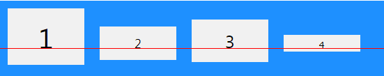
در این تصویر خط قرمز، baseline متنی را مشخص می کند؛ یعنی پایین ترین قسمت متنِ آیتم ها بدون توجه به شکل آیتم.
امیدوارم از این قسمت لذت برده باشید. در قسمت بعدی خصوصیات دیگر مدل Flexbox را بررسی خواهیم کرد.
ترتیبی که روکسو برای مطالعهی دروس سری CSS پیشرفته
توصیه میکند:

دورههای آموزشی مرتبط

مقالات مرتبط
17 اردیبهشت 1401
15 اردیبهشت 1401
11 بهمن 1400
07 اردیبهشت 1400
09 مرداد 1399


در این قسمت، به پرسشهای تخصصی شما دربارهی محتوای مقاله پاسخ داده نمیشود. سوالات خود را اینجا بپرسید.