 ترتیبی که روکسو برای مطالعهی دروس سری CSS پیشرفته
توصیه میکند:
ترتیبی که روکسو برای مطالعهی دروس سری CSS پیشرفته
توصیه میکند:
ساخت tooltip در زبان CSS
29 خرداد 1398
 درس 9 از سری CSS پیشرفته

tooltip چیست؟
tooltip ها به شکل های مختلفی دیده می شوند اما اکثر آن ها کادری مستطیل شکل یا مربع شکل اند که حاوی اطلاعات اضافی در مورد عنصر خاصی می باشند. این دسته از اطلاعات معمولا به صورت توضیحات اضافی هستند که نیازی به حضور آن ها در متن اصلی نیست؛ به طور مثال توضیحاتی در مورد چیزی که اکثر کاربران سایت از آن خبر دارند اما ممکن است عده ی کمی هنوز درباره ی آن اطلاعی نداشته باشند. tooltip ها تنها زمانی نمایش داده می شوند که کاربر روی عنصر خاصی hover کند (موس را روی آن بیاورد).
یک مثال بسیار ساده از tooltip ها را در کد زیر می بینید:
<!DOCTYPE html>
<html>
<style>
.tooltip {
position: relative;
display: inline-block;
border-bottom: 1px dotted black;
}
.tooltip .tooltiptext {
visibility: hidden;
width: 150px;
background-color: black;
color: #fff;
text-align: center;
border-radius: 6px;
padding: 5px 0;
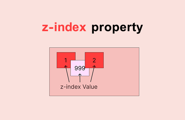
/* tooltip موقعیت دهی به */
position: absolute;
z-index: 1;
}
.tooltip:hover .tooltiptext {
visibility: visible;
}
</style>
<body style="text-align:center;">
<p>Move the mouse over the text below:</p>
<div class="tooltip">موس را روی این عنصر بیاورید
<span dir='rtl' class="tooltiptext">این متن tooltip ما می باشد</span>
</div>
<p dir='rtl'>توجه کنید که موقعیت tooltip ما موقعیت مناسبی نیست. در مثال های بعد این مشکل را حل خواهیم کرد.</p>
</body>
</html>
بگذارید نحوه ی کد نویسی این مثال را مرور کنیم!
کدهای HTML: از یک عنصر به عنوان نگهدارنده (مثلا <div>) استفاده کنید و به آن کلاس tooltip بدهید. حالا زمانی که موس کاربر روی این عنصر (<div>) بیاید، متن tooltip نمایش داده می شود. متن tooltip خودمان را نیز باید در یک عنصر از نوع inline (مانند یک <span>) بنویسیم و به آن کلاس "class="tooltiptext را بدهیم.
کدهای CSS: کلاس tooltip از خاصیت position:relative استفاده می کند تا بتوانیم موقعیت متن tooltip را تنظیم کنید (خاصیت position:absolute). از طرفی کلاس tooltiptext نیز خودِ tooltip را نگه می دارد و در حالت پیش فرض مخفی (hidden) است مگر آنکه hover انجام شود. از طرفی برای آنکه tooltip ما ظاهر بهتری داشته باشد، آن را کمی استایل دهی کرده ایم (اضافه کردن width، اضافه کردن background color سیاه، متن سفید، در مرکز قرار دادن متن (centered) و اضافه کردن padding به اندازه ی 5 پیکسل). همچنین از خاصیت border-radius استفاده کرده ایم تا گوشه های tooltip را گِرد کنیم. در آخر هم از hover: استفاده کرده ایم تا اگر موس روی عنصر <div> با کلاس "class="tooltip رفت اتفاق خاصی انجام بگیرد.
موقعیت دهی tooltip در css
در مثال زیر، tooltip را در سمت راست (%left:105) متن اصلی (عنصر <div>) قرار داده ایم. سپس از خاصیت top:-5px نیز استفاده کرده ایم تا آن را دقیقا در وسط عنصر نگهدارنده اش قرار دهیم (دلیل اینکه مقدارش را 5 گذاشته ایم، همان padding است که مقدارش 5 بود). بنابراین اگر مقدار padding را افزایش دادید، باید مقدار top را نیز افزایش دهید تا tooltip ما در وسط باقی بماند. ما در دو مثال زیر دو tooltip داریم که اولی را از راست و دومی را از چپ ایجاد کرده ایم:
Tooltip از راست:
<!DOCTYPE html>
<html>
<style>
.tooltip {
  position: relative;
  display: inline-block;
  border-bottom: 1px dotted black;
}

.tooltip .tooltiptext {
  visibility: hidden;
  width: 120px;
  background-color: black;
  color: #fff;
  text-align: center;
  border-radius: 6px;
  padding: 5px 0;

  /* Position the tooltip */
  position: absolute;
  z-index: 1;
  top: -5px;
  left: 105%;
}

.tooltip:hover .tooltiptext {
  visibility: visible;
}
</style>
<body style="text-align:center;">

<h2>Right Tooltip</h2>
<p>Move the mouse over the text below:</p>

<div class="tooltip">Hover over me
  <span class="tooltiptext">Tooltip text</span>
</div>

</body>
</html>
Tooltip از چپ:
<!DOCTYPE html>
<html>
<style>
.tooltip {
  position: relative;
  display: inline-block;
  border-bottom: 1px dotted black;
}

.tooltip .tooltiptext {
  visibility: hidden;
  width: 120px;
  background-color: black;
  color: #fff;
  text-align: center;
  border-radius: 6px;
  padding: 5px 0;

  /* Position the tooltip */
  position: absolute;
  z-index: 1;
  top: -5px;
  right: 105%;
}

.tooltip:hover .tooltiptext {
  visibility: visible;
}
</style>
<body style="text-align:center;">

<h2>Left Tooltip</h2>
<p>Move the mouse over the text below:</p>

<div class="tooltip">Hover over me
  <span class="tooltiptext">Tooltip text</span>
</div>

</body>
</html>
اما سوالی پیش می آید؛ اگر بخواهیم tooltip در بالا یا پایین (به جای چپ و راست) ظاهر شود چطور؟ ما برای این کار از margin-left استفاده کرده ایم و به آن مقدار 60 پیکسل داده ایم. واضح است که این کار برای قرار دادن tooltip در مرکز عنصر اصلی (متنی که hover می شود) است. این مقدار دقیقا نصف عرض tooltip ما است (120 تقسیم بر 2 مساوی است با 60). در دو مثال زیر tooltip های بالا و پایین را می بینید:
ایجاد tooltip از بالا:
<!DOCTYPE html>
<html>
<style>
.tooltip {
  position: relative;
  display: inline-block;
  border-bottom: 1px dotted black;
}

.tooltip .tooltiptext {
  visibility: hidden;
  width: 120px;
  background-color: black;
  color: #fff;
  text-align: center;
  border-radius: 6px;
  padding: 5px 0;

  /* Position the tooltip */
  position: absolute;
  z-index: 1;
  bottom: 100%;
  left: 50%;
  margin-left: -60px;
}

.tooltip:hover .tooltiptext {
  visibility: visible;
}
</style>
<body style="text-align:center;">

<h2>Top Tooltip</h2>
<p>Move the mouse over the text below:</p>

<div class="tooltip">Hover over me
  <span class="tooltiptext">Tooltip text</span>
</div>

</body>
</html>
ایجاد tooltip از پایین:
<!DOCTYPE html>
<html>
<style>
.tooltip {
  position: relative;
  display: inline-block;
  border-bottom: 1px dotted black;
}

.tooltip .tooltiptext {
  visibility: hidden;
  width: 120px;
  background-color: black;
  color: #fff;
  text-align: center;
  border-radius: 6px;
  padding: 5px 0;

  /* Position the tooltip */
  position: absolute;
  z-index: 1;
  top: 100%;
  left: 50%;
  margin-left: -60px;
}

.tooltip:hover .tooltiptext {
  visibility: visible;
}
</style>
<body style="text-align:center;">

<h2>Bottom Tooltip</h2>
<p>Move the mouse over the text below:</p>

<div class="tooltip">Hover over me
  <span class="tooltiptext">Tooltip text</span>
</div>

</body>
</html>
ایجاد arrow (پیکان) برای tooltip در css
احتمالا در دنیای مجازی دیده اید که اکثر tooltip ها دارای حالتی شبیه به یک پیکان هستند. برای ایجاد این حالت باید از شبه عنصر after:: به همراه خاصیت content استفاده کنیم (البته خود پیکان با border ایجاد می شود). به مثال زیر توجه کنید:
<!DOCTYPE html>
<html>
<style>
.tooltip {
  position: relative;
  display: inline-block;
  border-bottom: 1px dotted black;
}

.tooltip .tooltiptext {
  visibility: hidden;
  width: 120px;
  background-color: black;
  color: #fff;
  text-align: center;
  border-radius: 6px;
  padding: 5px 0;
  position: absolute;
  z-index: 1;
  bottom: 150%;
  left: 50%;
  margin-left: -60px;
}

.tooltip .tooltiptext::after {
  content: "";
  position: absolute;
  top: 100%;
  left: 50%;
  margin-left: -5px;
  border-width: 5px;
  border-style: solid;
  border-color: black transparent transparent transparent;
}

.tooltip:hover .tooltiptext {
  visibility: visible;
}
</style>
<body style="text-align:center;">

<h2>Top Tooltip w/ Bottom Arrow</h2>

<div class="tooltip">Hover over me
  <span class="tooltiptext">Tooltip text</span>
</div>

</body>
</html>
در مثال بالا ابتدا پیکان را داخل tooltip قرار داده ایم؛ خاصیت top: 100% پیکان را در پایین tooltip قرار داده و left: 50% نیز آن را در وسط قرار می دهد. توجه داشته باشید که border-width اندازه ی این پیکان را مشخص می کند. بنابراین اگر آن را تغییر دادید، باید margin-left را نیز به همان مقدار تغییر دهید تا پیکان در وسط باقی بماند.
سپس از border-color استفاده کرده ایم تا محتوا را به پیکان تبدیل کنیم. بعد حاشیه ی بالا را به رنگ سیاه و بقیه را transparent (شفاف) قرار داده ایم. اگر تمام جهات را سیاه قرار می دادیم طرح نهایی به صورت یک مربع سیاه رنگ در می آمد. در مثال های زیر این پیکان را از جهت های مختلف قرار داده ایم.
پیکان از سمت بالا:
<!DOCTYPE html>
<html>
<style>
.tooltip {
  position: relative;
  display: inline-block;
  border-bottom: 1px dotted black;
}

.tooltip .tooltiptext {
  visibility: hidden;
  width: 120px;
  background-color: black;
  color: #fff;
  text-align: center;
  border-radius: 6px;
  padding: 5px 0;
  position: absolute;
  z-index: 1;
  top: 150%;
  left: 50%;
  margin-left: -60px;
}

.tooltip .tooltiptext::after {
  content: "";
  position: absolute;
  bottom: 100%;
  left: 50%;
  margin-left: -5px;
  border-width: 5px;
  border-style: solid;
  border-color: transparent transparent black transparent;
}

.tooltip:hover .tooltiptext {
  visibility: visible;
}
</style>
<body style="text-align:center;">

<h2>Bottom Tooltip w/ Top Arrow</h2>

<div class="tooltip">Hover over me
  <span class="tooltiptext">Tooltip text</span>
</div>

</body>
</html>
پیکان از سمت چپ:
<!DOCTYPE html>
<html>
<style>
.tooltip {
  position: relative;
  display: inline-block;
  border-bottom: 1px dotted black;
}

.tooltip .tooltiptext {
  visibility: hidden;
  width: 120px;
  background-color: black;
  color: #fff;
  text-align: center;
  border-radius: 6px;
  padding: 5px 0;
  position: absolute;
  z-index: 1;
  top: -5px;
  left: 110%;
}

.tooltip .tooltiptext::after {
  content: "";
  position: absolute;
  top: 50%;
  right: 100%;
  margin-top: -5px;
  border-width: 5px;
  border-style: solid;
  border-color: transparent black transparent transparent;
}
.tooltip:hover .tooltiptext {
  visibility: visible;
}
</style>
<body style="text-align:center;">

<h2>Right Tooltip w/ Left Arrow</h2>

<div class="tooltip">Hover over me
  <span class="tooltiptext">Tooltip text</span>
</div>

</body>
</html>
پیکان از سمت راست:
<!DOCTYPE html>
<html>
<style>
.tooltip {
  position: relative;
  display: inline-block;
  border-bottom: 1px dotted black;
}

.tooltip .tooltiptext {
  visibility: hidden;
  width: 120px;
  background-color: black;
  color: #fff;
  text-align: center;
  border-radius: 6px;
  padding: 5px 0;
  position: absolute;
  z-index: 1;
  top: -5px;
  right: 110%;
}

.tooltip .tooltiptext::after {
  content: "";
  position: absolute;
  top: 50%;
  left: 100%;
  margin-top: -5px;
  border-width: 5px;
  border-style: solid;
  border-color: transparent transparent transparent black;
}
.tooltip:hover .tooltiptext {
  visibility: visible;
}
</style>
<body style="text-align:center;">

<h2>Left Tooltip w/ Right Arrow</h2>

<div class="tooltip">Hover over me
  <span class="tooltiptext">Tooltip text</span>
</div>

</body>
</html>
اضافه کردن انیمیشن
می توانید از قابلیت transition در زبان CSS استفاده کرده و آن را با خصوصیت opacity ترکیب کنید تا ظاهر شدن tooltip را با انیمیشن انجام دهید. در این حالت tooltip به آرامی از 0 درصد opacity به 100 درصد می رسد. ما در مثال زیر مقدار زمان مورد نظر را 1 ثانیه در نظر گرفته ایم:
<!DOCTYPE html>
<html>
<style>
.tooltip {
  position: relative;
  display: inline-block;
  border-bottom: 1px dotted black;
}

.tooltip .tooltiptext {
  visibility: hidden;
  width: 120px;
  background-color: black;
  color: #fff;
  text-align: center;
  border-radius: 6px;
  padding: 5px 0;
  position: absolute;
  z-index: 1;
  bottom: 100%;
  left: 50%;
  margin-left: -60px;

  /* Fade in tooltip - takes 1 second to go from 0% to 100% opac: */
  opacity: 0;
  transition: opacity 1s;
}

.tooltip:hover .tooltiptext {
  visibility: visible;
  opacity: 1;
}
</style>
<body style="text-align:center;">

<h2>Fade In Tooltip on Hover</h2>
<p>When you move the mouse over the text below, the tooltip text will fade in and take 1 second to go from completely invisible to visible.</p>

<div class="tooltip">Hover over me
  <span class="tooltiptext">Tooltip text</span>
</div>

</body>
</html>
پلاگین ها
این مقاله برای درک بهتر شما از نحوه ی کارکرد tooltip ها و همچنین افزایش مهارت کدنویسی شما در نظر گرفته شده است. پیشنهاد شخصی بنده این است که همیشه از پلاگین های جاوا اسکریپت tooltip برای کار با آن ها استفاده کنید. این پلاگین ها معمولا بسیار سبک و در عین حال بسیار پیشرفته هستند، در حالی که پلاگین مطرح شده دراین مقاله بسیار ابتدایی است.
یکی از این پلاگین های قدرتمند، پلاگین tippyjs می باشد که می توانید با مراجعه به وب سایت آن، در مورد نحوه ی استفاده و کار با آن اطلاعات کافی را کسب کنید.
ترتیبی که روکسو برای مطالعهی دروس سری CSS پیشرفته
توصیه میکند:

دورههای آموزشی مرتبط

مقالات مرتبط
17 اردیبهشت 1401
15 اردیبهشت 1401
11 بهمن 1400
07 اردیبهشت 1400
09 مرداد 1399
آخرین سوالات کاربران
alisadinm90 در 3 سال قبل پرسیده:
alidniry در 3 سال قبل پرسیده:
sepehr_sedigh در 3 سال قبل پرسیده:
fatehin در 3 سال قبل پرسیده:
amir4784 در 3 سال قبل پرسیده:
ما را دنبال کنید


در این قسمت، به پرسشهای تخصصی شما دربارهی محتوای مقاله پاسخ داده نمیشود. سوالات خود را اینجا بپرسید.
در این قسمت، به پرسشهای تخصصی شما دربارهی محتوای مقاله پاسخ داده نمیشود. سوالات خود را اینجا بپرسید.