 ترتیبی که روکسو برای مطالعهی دروس سری CSS پیشرفته
توصیه میکند:
ترتیبی که روکسو برای مطالعهی دروس سری CSS پیشرفته
توصیه میکند:
کار با container (نگهدارندهی) grid
17 تیر 1398
 درس 24 از سری CSS پیشرفته

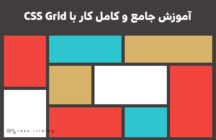
نگهدارنده های grid یا grid container در CSS
برای آنکه یک عنصر HTML را به Grid Container تبدیل کنید باید مقدار display آن را روی grid یا inline-grid قرار دهید. Grid container ها شامل آیتم های grid هستند که خودشان داخل ستون ها و ردیف های فرضی قرار دارند. به این مثال توجه کنید:
<!DOCTYPE html>
<html>
<head>
<style>
.grid-container {
  display: grid;
  grid-template-columns: auto auto auto auto;
  grid-gap: 10px;
  background-color: #2196F3;
  padding: 10px;
}

.grid-container > div {
  background-color: rgba(255, 255, 255, 0.8);
  border: 1px solid black;
  text-align: center;
  font-size: 30px;
}
</style>
</head>
<body>

<h1>Grid Container</h1>

<p>A Grid Container consists of grid items arranged in columns and rows</p>

<div class="grid-container">
  <div>1</div>
  <div>2</div>
  <div>3</div>
  <div>4</div>
  <div>5</div>
  <div>6</div>
  <div>7</div>
  <div>8</div>
</div>

<p>Direct child elements(s) of the grid container automatically becomes grid items.</p>

</body>
</html>
در مثال بالا مستطیل آبی رنگی که آیتم ها درونش قرار دارند همان نگهدارنده یا container ما است. در این مقاله می خواهیم نحوه ی کار با آن و مسائل مربوط به آن را بررسی کنیم.
خصوصیت grid-template-columns
خصوصیت grid-template-columns تعداد ستون های grid شما و عرض هر ستون را مشخص می کند. مقادیری که این خصوصیت می گیرد با اسپیس از هم جدا می شوند و هر مقدار عرض ستون متناظرش را تعیین می کند. فرض کنید می خواهید یک grid چهار ستونه داشته باشید؛ اگر شما بخواهید ستون های این grid دارای عرض یکسانی باشند، باید چهار بار auto را به آن بدهید و در غیر این صورت باید مقدار عرض ستون ها را مشخص کنید:
<!DOCTYPE html>
<html>
<head>
<style>
.grid-container {
  display: grid;
  grid-template-columns: auto auto auto auto;
  grid-gap: 10px;
  background-color: #2196F3;
  padding: 10px;
}

.grid-container > div {
  background-color: rgba(255, 255, 255, 0.8);
  text-align: center;
  padding: 20px 0;
  font-size: 30px;
}
</style>
</head>
<body>

<h1>grid-template-columns</h1>

<p>You can use the <em>grid-template-columns</em> property to specify the number of columns in your grid layout.</p>

<div class="grid-container">
  <div>1</div>
  <div>2</div>
  <div>3</div>
  <div>4</div>
  <div>5</div>
  <div>6</div>
  <div>7</div>
  <div>8</div>
</div>

</body>
</html>
نکته: اگر تعداد ستون های شما بیشتر از 4 عدد باشد، ستون های بعدی به صورت خودکار به یک ردیف جدید منتقل می شوند.
خصوصیت grid-template-columns عرض ستون ها را نیز مشخص می کند. به این مثال توجه کنید:
<!DOCTYPE html>
<html>
<head>
<style>
.grid-container {
  display: grid;
  grid-template-columns: 80px 200px auto 30px;
  grid-gap: 10px;
  background-color: #2196F3;
  padding: 10px;
}

.grid-container > div {
  background-color: rgba(255, 255, 255, 0.8);
  text-align: center;
  padding: 20px 0;
  font-size: 30px;
}
</style>
</head>
<body>

<h1>grid-template-columns</h1>

<p>Use the <em>grid-template-columns</em> property to specify the size of each column.</p>

<div class="grid-container">
  <div>1</div>
  <div>2</div>
  <div>3</div>
  <div>4</div>
  <div>5</div>
  <div>6</div>
  <div>7</div>
  <div>8</div>
</div>

</body>
</html>
همانطور که می بینید عرض ستون ها بر اساس چیزی که در کد تعریف شده، متفاوت است.
خصوصیت grid-template-rows
خصوصیت grid-template-rows ارتفاع هر ستون را مشخص می کند. مثال آن بسیار ساده و قابل درک است؛ مقادیر آن دقیقا مانند خصوصیت grid-template-columns با اسپیس از هم جدا می شوند و هر مقدار ارتفاع ستون متناظرش را تعیین می کند:
<!DOCTYPE html>
<html>
<head>
<style>
.grid-container {
  display: grid;
  grid-template-columns: auto auto auto;
  grid-template-rows: 80px 200px;
  grid-gap: 10px;
  background-color: #2196F3;
  padding: 10px;
}

.grid-container > div {
  background-color: rgba(255, 255, 255, 0.8);
  text-align: center;
  padding: 20px 0;
  font-size: 30px;
}
</style>
</head>
<body>

<h1>The grid-template-rows Property</h1>

<div class="grid-container">
  <div>1</div>
  <div>2</div>
  <div>3</div>
  <div>4</div>
  <div>5</div>
  <div>6</div>
</div>

<p>Use the <em>grid-template-rows</em> property to specify the size (height) of each row.</p>

</body>
</html>
تفاوت ارتفاع ستون ها در مثال بالا کاملا مشخص است.
خصوصیت justify-content
خصوصیت justify-content تمام موارد داخل نگهدارنده را تراز می کند. البته برای آنکه این خصوصیت تاثیری داشته باشد باید عرض کل grid از عرض container (نگهدارنده) کمتر باشد.
مثال اول:
<!DOCTYPE html>
<html>
<head>
<style>
.grid-container {
  display: grid;
  justify-content: space-evenly;
  grid-template-columns: 50px 50px 50px; /*Make the grid smaller than the container*/
  grid-gap: 10px;
  background-color: #2196F3;
  padding: 10px;
}

.grid-container > div {
  background-color: rgba(255, 255, 255, 0.8);
  text-align: center;
  padding: 20px 0;
  font-size: 30px;
}
</style>
</head>
<body>

<h1>The justify-content Property</h1>

<p dir='rtl'>با استفاده از خصوصیت<em>justify-content</em> میتوانید grid را داخل نگهدارنده تراز کنید.</p>

<p dir='rtl'>مقدار "space-evenly" به اطراف و بین ستون ها به مقدار یکسان فضای خالی اضافه می کند.</p>

<div class="grid-container">
  <div>1</div>
  <div>2</div>
  <div>3</div>
  <div>4</div>
  <div>5</div>
  <div>6</div>
</div>


</body>
</html>
مقدار "space-evenly" به اطراف و بین ستون ها به مقدار یکسان فضای خالی اضافه می کند.
مثال هایی از مقادیر دیگر این خصوصیت:
مثال اول:
.grid-container {
  display: grid;
  justify-content: space-around;
}
مقدار space-around به اطراف ستون ها فضای خالی اضافه می کند.
مثال دوم:
.grid-container {
  display: grid;
  justify-content: space-between;
}
مقدار space-between بین ستون ها فضای خالی ایجاد می کند.
مثال سوم:
.grid-container {
  display: grid;
  justify-content: center;
}
مقدار center تمام grid را در وسط نگهدارنده قرار می دهد.
مثال چهارم:
.grid-container {
  display: grid;
  justify-content: start;
}
مقدار start تمام grid را در ابتدای نگهدارنده قرار می دهد.
مثال پنجم:
.grid-container {
  display: grid;
  justify-content: end;
}
مقدار end تمام grid را در آخر نگهدارنده قرار می دهد.
خصوصیت align-content
خصوصیت align-content تمام grid را از نظر محور عمودی در وسط نگهدارنده قرار می دهد. توجه داشته باشید که اگر ارتفاع کل grid از ارتفاع نگهدارنده بیشتر باشد این دستور به هیچ وجه کار نخواهد کرد.
<!DOCTYPE html>
<html>
<head>
<style>
.grid-container {
  display: grid;
  height: 400px;
  align-content: center;
  grid-template-columns: auto auto auto;
  grid-gap: 10px;
  background-color: #2196F3;
  padding: 10px;
}

.grid-container > div {
  background-color: rgba(255, 255, 255, 0.8);
  text-align: center;
  padding: 20px 0;
  font-size: 30px;
}
</style>
</head>
<body>

<h1>The align-content Property</h1>

<p dir='rtl'>با استفاده از خصوصیت <em>align-content</em> می توانید grid را از نظر محور عمودی در وسط نگهدارنده قرار دهید.</p>

<p dir='rtl'>مقدار "center" ردیف ها را در وسط نگهدارنده تراز می کند.</p>

<div class="grid-container">
  <div>1</div>
  <div>2</div>
  <div>3</div>
  <div>4</div>
  <div>5</div>
  <div>6</div>
</div>


</body>
</html>
مقدار "center" ردیف ها را در وسط نگهدارنده تراز می کند.
مثال هایی از مقادیر دیگر این خصوصیت:
مثال اول:
.grid-container {
  display: grid;
  height: 400px;
  align-content: space-evenly;
}
مقدار space-evenly به اطراف ردیف ها و همچنین بین ردیف ها مقدار فضای خالی یکسانی اضافه می کند.
مثال دوم:
.grid-container {
  display: grid;
  height: 400px;
  align-content: space-around;
}
مقدار space-around در اطراف ردیف ها فضای خالی ایجاد می کند.
مثال سوم:
.grid-container {
  display: grid;
  height: 400px;
  align-content: space-between;
}
مقدار space-between بین ردیف ها فضای خالی ایجاد می کند.
مثال چهارم:
.grid-container {
  display: grid;
  height: 400px;
  align-content: start;
}
مقدار start تمام grid را در ابتدای نگهدارنده قرار می دهد.
مثال پنجم:
.grid-container {
  display: grid;
  height: 400px;
  align-content: end;
}
مقدار end تمام grid را در آخر نگهدارنده قرار می دهد.
امیدواریم از بحث grid container در CSS لذت برده باشید و این درس از سری آموزش CSS پیشرفته برای شما عزیزان مفید بوده باشد.
ترتیبی که روکسو برای مطالعهی دروس سری CSS پیشرفته
توصیه میکند:

دورههای آموزشی مرتبط

مقالات مرتبط
17 اردیبهشت 1401
15 اردیبهشت 1401

11 بهمن 1400
07 اردیبهشت 1400
09 مرداد 1399


در این قسمت، به پرسشهای تخصصی شما دربارهی محتوای مقاله پاسخ داده نمیشود. سوالات خود را اینجا بپرسید.