 ترتیبی که روکسو برای مطالعهی دروس سری CSS پیشرفته
توصیه میکند:
ترتیبی که روکسو برای مطالعهی دروس سری CSS پیشرفته
توصیه میکند:
قسمت پایانی: آیتم های grid در CSS
17 تیر 1398
 درس 25 از سری CSS پیشرفته

کار با آیتم های Grid در زبان CSS
سلام! به آخرین قسمت از دوره ی CSS پیشرفته که راجع به کار آیتم های grid در CSS است، با خوش آمدید.
همانطور که می دانید نگهدارنده (container) در grid ها دارای عناصری هستند که به آن ها آیتم می گوییم. یعنی هر عنصری که داخل این نگهدارنده ها قرار بگیرد یک آیتم محسوب می شود. در حالت عادی هر نگهدارنده برای هر ستون خود یک آیتم را در نظر می گیرد اما ما می توانیم با دستورات CSS آن ها را بزرگتر یا کوچکتر کنیم.
خصوصیت grid-column
خصوصیت grid-column تعیین می کند که هر آیتم در کدام ستون قرار بگیرد؛ به عبارت دیگر به آیتم می گویید که از کجا شروع کرده و در آخر به کجا برسد. آیا متوجه شدید؟ دستور grid-column در واقع خلاصه ی دستورات grid-column-start و grid-column-end است!
برای موقعیت دهی به یک آیتم می توانید از دو راه عمل کنید:
- خط شروع را مشخص کرده و خط پایان را هم مشخص کنید.
- خط شروع را مشخص کرده و تعداد خط های اشغال شونده را مشخص کنید.
در حالت اول می گوییم مثلا آیتم ما باید از خط 1 شروع شده و تا خط پنجم ادامه داشته باشد:
<!DOCTYPE html>
<html>
<head>
<style>
.grid-container {
  display: grid;
  grid-template-columns: auto auto auto auto auto auto;
  grid-gap: 10px;
  background-color: #2196F3;
  padding: 10px;
}

.grid-container > div {
  background-color: rgba(255, 255, 255, 0.8);
  text-align: center;
  padding: 20px 0;
  font-size: 30px;
}

.item1 {
  grid-column: 1 / 5;
}
</style>
</head>
<body>

<h1>The grid-column Property</h1>

<p>Use the <em>grid-column</em> property to specify where to place an item.</p>
<p>Item1 will start on column-line 1 and end on column-line 5:</p>

<div class="grid-container">
  <div class="item1">1</div>
  <div class="item2">2</div>
  <div class="item3">3</div>
  <div class="item4">4</div>
  <div class="item5">5</div>
  <div class="item6">6</div>
  <div class="item7">7</div>
  <div class="item8">8</div>
  <div class="item9">9</div>
  <div class="item10">10</div>
  <div class="item11">11</div>
  <div class="item12">12</div>
  <div class="item13">13</div>
  <div class="item14">14</div>
  <div class="item15">15</div>
</div>

</body>
</html>
در حالت دوم می گوییم آیتم ما باید از خط اول شروع شده و به اندازه ی 3 ستون ادامه پیدا کند:
<!DOCTYPE html>
<html>
<head>
<style>
.grid-container {
  display: grid;
  grid-template-columns: auto auto auto auto auto auto;
  grid-gap: 10px;
  background-color: #2196F3;
  padding: 10px;
}

.grid-container > div {
  background-color: rgba(255, 255, 255, 0.8);
  text-align: center;
  padding: 20px 0;
  font-size: 30px;
}

.item1 {
  grid-column: 1 / span 3;
}
</style>
</head>
<body>

<h1>The grid-column Property</h1>

<p>Use the <em>grid-column</em> property to specify where to place an item.</p>
<p>Item1 will start on column-line 1 and span 3 columns:</p>

<div class="grid-container">
  <div class="item1">1</div>
  <div class="item2">2</div>
  <div class="item3">3</div>
  <div class="item4">4</div>
  <div class="item5">5</div>
  <div class="item6">6</div>
  <div class="item7">7</div>
  <div class="item8">8</div>
  <div class="item9">9</div>
  <div class="item10">10</div>
  <div class="item11">11</div>
  <div class="item12">12</div>
  <div class="item13">13</div>
  <div class="item14">14</div>
  <div class="item15">15</div>
  <div class="item16">16</div>
</div>

</body>
</html>
و یا به طور مثال می گوییم آیتمی که کلاس item2 را دارد باید از ستون دوم شروع شده و تا 3 ستون بعد ادامه پیدا کند:
<!DOCTYPE html>
<html>
<head>
<style>
.grid-container {
  display: grid;
  grid-template-columns: auto auto auto auto auto auto;
  grid-gap: 10px;
  background-color: #2196F3;
  padding: 10px;
}

.grid-container > div {
  background-color: rgba(255, 255, 255, 0.8);
  text-align: center;
  padding: 20px 0;
  font-size: 30px;
}

.item2 {
  grid-column: 2 / span 3;
}
</style>
</head>
<body>

<h1>The grid-column Property</h1>

<p>Use the <em>grid-column</em> property to specify where to place an item.</p>
<p>Item2 will start on column line 2 and span 3 columns:</p>

<div class="grid-container">
  <div class="item1">1</div>
  <div class="item2">2</div>
  <div class="item3">3</div>
  <div class="item4">4</div>
  <div class="item5">5</div>
  <div class="item6">6</div>
  <div class="item7">7</div>
  <div class="item8">8</div>
  <div class="item9">9</div>
  <div class="item10">10</div>
  <div class="item11">11</div>
  <div class="item12">12</div>
  <div class="item13">13</div>
  <div class="item14">14</div>
  <div class="item15">15</div>
  <div class="item16">16</div>
</div>

</body>
</html>
خصوصیت grid-row
خصوصیت grid-row تعیین می کند که آیتم ما در چه ردیفی (نه ستون!) قرار بگیرد. مانند دستور قبلی باید نقاط شروع و پایان را برای آیتم خود تعیین کنیم و همانطور که حدس میزنید خصوصیت grid-row دستور خلاصه شده ی grid-row-start و grid-row-end است.
همچنین دو حالتی که برای خصوصیت بالا ذکر کردیم برای این خصوصیت هم صادق است. بنابراین در مثال اول می گوییم آیتم ما باید از ردیف اول شروع شده و تا ردیف چهارم ادامه پیدا کند:
<!DOCTYPE html>
<html>
<head>
<style>
.grid-container {
  display: grid;
  grid-template-columns: auto auto auto auto auto auto;
  grid-gap: 10px;
  background-color: #2196F3;
  padding: 10px;
}

.grid-container > div {
  background-color: rgba(255, 255, 255, 0.8);
  text-align: center;
  padding: 20px 0;
  font-size: 30px;
}

.item1 {
  grid-row: 1 / 4;
}
</style>
</head>
<body>

<h1>The grid-row Property</h1>

<p>Use the <em>grid-row</em> property to specify where to place an item.</p>
<p>Item1 will start on row-line 1 and end on row-line 4:</p>

<div class="grid-container">
  <div class="item1">1</div>
  <div class="item2">2</div>
  <div class="item3">3</div>
  <div class="item4">4</div>
  <div class="item5">5</div>
  <div class="item6">6</div>
  <div class="item7">7</div>
  <div class="item8">8</div>
  <div class="item9">9</div>
  <div class="item10">10</div>
  <div class="item11">11</div>
  <div class="item12">12</div>
  <div class="item13">13</div>
  <div class="item14">14</div>
  <div class="item15">15</div>
  <div class="item16">16</div>
</div>

</body>
</html>
و برای مثال دوم می گوییم آیتم ما باید از ردیف اول شروع شده و تا 2 ردیف بعد را شامل شود:
<!DOCTYPE html>
<html>
<head>
<style>
.grid-container {
  display: grid;
  grid-template-columns: auto auto auto auto auto auto;
  grid-gap: 10px;
  background-color: #2196F3;
  padding: 10px;
}

.grid-container > div {
  background-color: rgba(255, 255, 255, 0.8);
  text-align: center;
  padding: 20px 0;
  font-size: 30px;
}

.item1 {
  grid-row: 1 / span 2;
}
</style>
</head>
<body>

<h1>The grid-row Property</h1>

<p>Use the <em>grid-row</em> property to specify where to place an item.</p>
<p>Item1 will start on row 1 and span 2 rows:</p>

<div class="grid-container">
  <div class="item1">1</div>
  <div class="item2">2</div>
  <div class="item3">3</div>
  <div class="item4">4</div>
  <div class="item5">5</div>
  <div class="item6">6</div>
  <div class="item7">7</div>
  <div class="item8">8</div>
  <div class="item9">9</div>
  <div class="item10">10</div>
  <div class="item11">11</div>
  <div class="item12">12</div>
  <div class="item13">13</div>
  <div class="item14">14</div>
  <div class="item15">15</div>
  <div class="item16">16</div>
  <div class="item17">17</div>
</div>

</body>
</html>
خصوصیت grid-area
دستور grid-area خلاصه شده ی دستورات grid-row-start و grid-column-start و grid-row-end و grid-column-end است.
به مثال های زیر دقت کنید:
مثال اول: به item8 می گوییم که از ردیف اول و ستون دوم شروع شده و در ردیف پنجم و ستون ششم تمام شود:
<!DOCTYPE html>
<html>
<head>
<style>
.grid-container {
  display: grid;
  grid-template-columns: auto auto auto auto auto auto;
  grid-gap: 10px;
  background-color: #2196F3;
  padding: 10px;
}

.grid-container > div {
  background-color: rgba(255, 255, 255, 0.8);
  text-align: center;
  padding: 20px 0;
  font-size: 30px;
}

.item8 {
  grid-area: 1 / 2 / 5 / 6;
}
</style>
</head>
<body>

<h1>The grid-area Property</h1>

<p>You can use the <em>grid-area</em> property to specify where to place an item.</p>

<p>The syntax is:</p>
<p>grid-row-start / grid-column-start / grid-row-end / grid-column-end.</p>

<p>Item8 will start on row-line 1 and column-line 2, and end on row-line 5 column-line 6:</p>

<div class="grid-container">
  <div class="item1">1</div>
  <div class="item2">2</div>
  <div class="item3">3</div>
  <div class="item4">4</div>
  <div class="item5">5</div>
  <div class="item6">6</div>
  <div class="item7">7</div>
  <div class="item8">8</div>
  <div class="item9">9</div>
  <div class="item10">10</div>
  <div class="item11">11</div>
  <div class="item12">12</div>
  <div class="item13">13</div>
  <div class="item14">14</div>
  <div class="item15">15</div>
</div>

</body>
</html>
مثال دوم: item8 باید از ردیف دوم و ستون اول شروع شده و تا دو ردیف و سه ستون ادامه پیدا کند:
<!DOCTYPE html>
<html>
<head>
<style>
.grid-container {
  display: grid;
  grid-template-columns: auto auto auto auto auto auto;
  grid-gap: 10px;
  background-color: #2196F3;
  padding: 10px;
}

.grid-container > div {
  background-color: rgba(255, 255, 255, 0.8);
  text-align: center;
  padding: 20px 0;
  font-size: 30px;
}

.item8 {
  grid-area: 2 / 1 / span 2 / span 3;
}
</style>
</head>
<body>

<h1>The grid-area Property</h1>

<p>You can use the <em>grid-area</em> property to specify where to place an item.</p>

<p>The syntax is grid-row-start / grid-column-start / grid-row-end / grid-column-end.</p>

<p>Item8 will start on row-line 2 and column-line 1, and span 2 rows and 3 columns:</p>

<div class="grid-container">
  <div class="item1">1</div>
  <div class="item2">2</div>
  <div class="item3">3</div>
  <div class="item4">4</div>
  <div class="item5">5</div>
  <div class="item6">6</div>
  <div class="item7">7</div>
  <div class="item8">8</div>
  <div class="item9">9</div>
  <div class="item10">10</div>
  <div class="item11">11</div>
  <div class="item12">12</div>
  <div class="item13">13</div>
</div>

</body>
</html>
نام گذاری آیتم ها
از خصوصیت grid-area می توان برای نام گذاری آیتم ها هم استفاده کرد!
سپس آیتم های نام گذاری شده را می توان با استفاده از grid-template-areas صدا زد. به مثال زیر توجه کنید.
در کد زیر نام آیتم اول را برابر myArea قرار داده ایم که در یک grid پنج ستونه تمام 5 ستون را اشغال می کند:
<!DOCTYPE html>
<html>
<head>
<style>
.item1 {
  grid-area: myArea;
}

.grid-container {
  display: grid;
  grid-template-areas: 'myArea myArea myArea myArea myArea';
  grid-gap: 10px;
  background-color: #2196F3;
  padding: 10px;
}

.grid-container > div {
  background-color: rgba(255, 255, 255, 0.8);
  text-align: center;
  padding: 20px 0;
  font-size: 30px;
}
</style>
</head>
<body>

<h1>The grid-area Property</h1>

<p>You can use the <em>grid-area</em> property to name grid items.</p>

<p>You can refer to the name when you set up the grid layout, by using the <em>grid-template-areas</em> property on the grid container.</p>

<p>Item1, is called "myArea" and will take up the place of all five columns:</p>

<div class="grid-container">
  <div class="item1">1</div>
  <div class="item2">2</div>
  <div class="item3">3</div>
  <div class="item4">4</div>
  <div class="item5">5</div>
  <div class="item6">6</div>
</div>

</body>
</html>
هر ردیف با استفاده از single quotation (علامت ') مشخص می شود. ستون های هر دریف داخل همین علامت تعریف و با اسپیس از هم جدا می شوند.
نکته: علامت نقطه یعنی آیتم ها هیچ نامی ندارد.
آیتم myArea در کد زیر دو ستون را اشغال کرده است. همچنین سه علامت نقطه نیز (همانطور که گفتیم) به معنی آیتم های بدون نام هستند:
<!DOCTYPE html>
<html>
<head>
<style>
.item1 {
  grid-area: myArea;
}

.grid-container {
  display: grid;
  grid-template-areas: 'myArea myArea . . .';
  grid-gap: 10px;
  background-color: #2196F3;
  padding: 10px;
}

.grid-container > div {
  background-color: rgba(255, 255, 255, 0.8);
  text-align: center;
  padding: 20px 0;
  font-size: 30px;
}
</style>
</head>
<body>

<h1>The grid-area Property</h1>

<p>You can use the <em>grid-area</em> property to name grid items.</p>

<p>You can refer to the name when you set up the grid layout, by using the <em>grid-template-areas</em> property on the grid container.</p>

<p>Item1, is called "myArea" and will take up the place of two columns (out of five):</p>

<div class="grid-container">
  <div class="item1">1</div>
  <div class="item2">2</div>
  <div class="item3">3</div>
  <div class="item4">4</div>
  <div class="item5">5</div>
  <div class="item6">6</div>
  <div class="item7">7</div>
  <div class="item8">8</div>
  <div class="item9">9</div>
</div>

</body>
</html>
اگر می خواهید دو ردیف مختلف داشته باشید، باید ستون مربوط به ردیف دوم را درون یک جفت Single quotation دیگر قرار بدهید:
<!DOCTYPE html>
<html>
<head>
<style>
.item1 {
  grid-area: myArea;
}

.grid-container {
  display: grid;
  grid-template-areas: 'myArea myArea . . .' 'myArea myArea . . .';
  grid-gap: 10px;
  background-color: #2196F3;
  padding: 10px;
}

.grid-container > div {
  background-color: rgba(255, 255, 255, 0.8);
  text-align: center;
  padding: 20px 0;
  font-size: 30px;
}
</style>
</head>
<body>

<h1>The grid-area Property</h1>

<p>You can use the <em>grid-area</em> property to name grid items.</p>

<p>You can refer to the name when you set up the grid layout, by using the <em>grid-template-areas</em> property on the grid container.</p>

<p>Item1, is called "myArea" and will take up the place of two columns (out of five), and will span two rows:</p>

<div class="grid-container">
  <div class="item1">1</div>
  <div class="item2">2</div>
  <div class="item3">3</div>
  <div class="item4">4</div>
  <div class="item5">5</div>
  <div class="item6">6</div>
  <div class="item7">7</div>
</div>

</body>
</html>
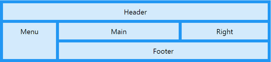
همچنین با نام گذاری تمام آیتم ها یک قالب آماده برای وب سایت خود خواهیم داشت:
<!DOCTYPE html>
<html>
<head>
<style>
.item1 { grid-area: header; }
.item2 { grid-area: menu; }
.item3 { grid-area: main; }
.item4 { grid-area: right; }
.item5 { grid-area: footer; }

.grid-container {
  display: grid;
  grid-template-areas:
    'header header header header header header'
    'menu main main main right right'
    'menu footer footer footer footer footer';
  grid-gap: 10px;
  background-color: #2196F3;
  padding: 10px;
}

.grid-container > div {
  background-color: rgba(255, 255, 255, 0.8);
  text-align: center;
  padding: 20px 0;
  font-size: 30px;
}
</style>
</head>
<body>

<h1>The grid-area Property</h1>

<p>You can use the <em>grid-area</em> property to name grid items.</p>

<p>You can refer to the name when you set up the grid layout, by using the <em>grid-template-areas</em> property on the grid container.</p>

<p>This grid layout contains six columns and three rows:</p>

<div class="grid-container">
  <div class="item1">Header</div>
  <div class="item2">Menu</div>
  <div class="item3">Main</div>
  <div class="item4">Right</div>
  <div class="item5">Footer</div>
</div>

</body>
</html>
ترتیب آیتم ها
سیستم grid به ما اجازه می دهد که آیتم ها را به ترتیب دلخواه خود و در مکان دلخواه خود قرار دهیم؛ به عبارت دیگر آیتمی که در کد HTML ما اول آمده است می تواند در خروجی آخرین آیتم باشد. به این مثال دقت کنید:
<!DOCTYPE html>
<html>
<head>
<style>
.grid-container {
  display: grid;
  grid-template-columns: auto auto auto;
  grid-gap: 10px;
  background-color: #2196F3;
  padding: 10px;
}

.grid-container > div {
  background-color: rgba(255, 255, 255, 0.8);
  text-align: center;
  padding: 20px 0;
  font-size: 30px;
}

.item1 { grid-area: 1 / 3 / 2 / 4; }
.item2 { grid-area: 2 / 3 / 3 / 4; }
.item3 { grid-area: 1 / 1 / 2 / 2; }
.item4 { grid-area: 1 / 2 / 2 / 3; }
.item5 { grid-area: 2 / 1 / 3 / 2; }
.item6 { grid-area: 2 / 2 / 3 / 3; }
</style>
</head>
<body>

<h1>Sort the Items</h1>

<p>The items do not have to be displayed in the same order as they are written in the HTML code.</p>

<div class="grid-container">
  <div class="item1">1</div>
  <div class="item2">2</div>
  <div class="item3">3</div>
  <div class="item4">4</div>
  <div class="item5">5</div>
  <div class="item6">6</div>
</div>

</body>
</html>
همچنین می توانیم با استفاده از media query ها این ترتیب را در سایز مختلف صفحات، به صورت مختلف نمایش دهیم تا هر سایز نمایشگری ترتیب خاصی را نشان دهد:
<!DOCTYPE html>
<html>
<head>
<style>
.grid-container {
  display: grid;
  grid-template-columns: auto auto auto;
  grid-gap: 10px;
  background-color: #2196F3;
  padding: 10px;
}

.grid-container > div {
  background-color: rgba(255, 255, 255, 0.8);
  text-align: center;
  padding: 20px 0;
  font-size: 30px;
}

@media only screen and (max-width: 500px) {
  .item1 { grid-area: 1 / span 3 / 2 / 4; }
  .item2 { grid-area: 3 / 3 / 4 / 4; }
  .item3 { grid-area: 2 / 1 / 3 / 2; }
  .item4 { grid-area: 2 / 2 / span 2 / 3; }
  .item5 { grid-area: 3 / 1 / 4 / 2; }
  .item6 { grid-area: 2 / 3 / 3 / 4; }
}
</style>
</head>
<body>

<h1>Re-arange the Order on Small Devices</h1>

<p>Resize the window to 500 pixels see the effect.</p>

<div class="grid-container">
  <div class="item1">1</div>
  <div class="item2">2</div>
  <div class="item3">3</div>
  <div class="item4">4</div>
  <div class="item5">5</div>
  <div class="item6">6</div>
</div>

</body>
</html>
این قسمت آخرین قسمت از دوره ی CSS پیشرفته بود، امیدوارم از آن لذت برده باشید.
ترتیبی که روکسو برای مطالعهی دروس سری CSS پیشرفته
توصیه میکند:

دورههای آموزشی مرتبط

مقالات مرتبط
17 اردیبهشت 1401
15 اردیبهشت 1401

11 بهمن 1400
07 اردیبهشت 1400
09 مرداد 1399


در این قسمت، به پرسشهای تخصصی شما دربارهی محتوای مقاله پاسخ داده نمیشود. سوالات خود را اینجا بپرسید.
در این قسمت، به پرسشهای تخصصی شما دربارهی محتوای مقاله پاسخ داده نمیشود. سوالات خود را اینجا بپرسید.
در این قسمت، به پرسشهای تخصصی شما دربارهی محتوای مقاله پاسخ داده نمیشود. سوالات خود را اینجا بپرسید.
در این قسمت، به پرسشهای تخصصی شما دربارهی محتوای مقاله پاسخ داده نمیشود. سوالات خود را اینجا بپرسید.
در این قسمت، به پرسشهای تخصصی شما دربارهی محتوای مقاله پاسخ داده نمیشود. سوالات خود را اینجا بپرسید.
در این قسمت، به پرسشهای تخصصی شما دربارهی محتوای مقاله پاسخ داده نمیشود. سوالات خود را اینجا بپرسید.
در این قسمت، به پرسشهای تخصصی شما دربارهی محتوای مقاله پاسخ داده نمیشود. سوالات خود را اینجا بپرسید.