 ترتیبی که روکسو برای مطالعهی دروس سری CSS پیشرفته
توصیه میکند:
ترتیبی که روکسو برای مطالعهی دروس سری CSS پیشرفته
توصیه میکند:
Media Query ها در طراحی واکنش گرا
15 تیر 1398
 درس 21 از سری CSS پیشرفته
دوستان عزیز به این قسمت از سری آموزش پیشرفته CSS خوش آمدید. در این درس به آموزش Media Query در CSS می پردازیم. همراه ما باشید.
Media Query در CSS چیست؟
Media query ها یکی از تکنیک های جدید در CSS3 هستند. اگر ما از دستور media@ استفاده کنیم و کد CSS ای را داخل آن قرار دهیم، آن کد تنها زمانی اجرا می شود که شرط خاصی برقرار باشد. به مثال زیر توجه کنید:
<!DOCTYPE html>
<html>
<head>
<meta name="viewport" content="width=device-width, initial-scale=1.0">
<style>
body {
  background-color: lightgreen;
}

@media only screen and (max-width: 600px) {
  body {
    background-color: lightblue;
  }
}
</style>
</head>
<body>

<p>Resize the browser window. When the width of this document is 600 pixels or less, the background-color is "lightblue", otherwise it is "lightgreen".</p>

</body>
</html>
با تغییر سایز قسمت خروجی کد بالا می بینید که رنگ پس زمینه پس از 600 پیکسل تغییر می کند!
ایجاد breakpoint ها
اگر یادتان باشد در قسمت قبلی این سری آموزشی طرحی را با استفاده از grid ایجاد کردیم اما این طرح کاملا واکنش گرا نبود و در عرض های بسیار پایین ظاهر جالبی نداشت. ما می توانیم breakpoint (نقاط شکست) ای را تعریف کنیم تا اگر عرض صفحه به آن نقطه رسید برخی از اجزاء صفحه شکل خاصی به خود بگیرند.
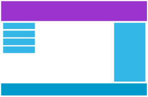

ما می خواهیم برای اصلاح طرح قبلی خود یک breakpoint را روی عرض 768px قرار دهیم:
<!DOCTYPE html>
<html>
<head>
<meta name="viewport" content="width=device-width, initial-scale=1.0">
<style>
* {
  box-sizing: border-box;
}

.row::after {
  content: "";
  clear: both;
  display: block;
}

[class*="col-"] {
  float: left;
  padding: 15px;
}

html {
  font-family: "Lucida Sans", sans-serif;
}

.header {
  background-color: #9933cc;
  color: #ffffff;
  padding: 15px;
}

.menu ul {
  list-style-type: none;
  margin: 0;
  padding: 0;
}

.menu li {
  padding: 8px;
  margin-bottom: 7px;
  background-color: #33b5e5;
  color: #ffffff;
  box-shadow: 0 1px 3px rgba(0,0,0,0.12), 0 1px 2px rgba(0,0,0,0.24);
}

.menu li:hover {
  background-color: #0099cc;
}

.aside {
  background-color: #33b5e5;
  padding: 15px;
  color: #ffffff;
  text-align: center;
  font-size: 14px;
  box-shadow: 0 1px 3px rgba(0,0,0,0.12), 0 1px 2px rgba(0,0,0,0.24);
}

.footer {
  background-color: #0099cc;
  color: #ffffff;
  text-align: center;
  font-size: 12px;
  padding: 15px;
}

/* For desktop: */
.col-1 {width: 8.33%;}
.col-2 {width: 16.66%;}
.col-3 {width: 25%;}
.col-4 {width: 33.33%;}
.col-5 {width: 41.66%;}
.col-6 {width: 50%;}
.col-7 {width: 58.33%;}
.col-8 {width: 66.66%;}
.col-9 {width: 75%;}
.col-10 {width: 83.33%;}
.col-11 {width: 91.66%;}
.col-12 {width: 100%;}

@media only screen and (max-width: 768px) {
  /* For mobile phones: */
  [class*="col-"] {
    width: 100%;
  }
}
</style>
</head>
<body>

<div class="header">
  <h1>Chania</h1>
</div>

<div class="row">
  <div class="col-3 menu">
    <ul>
    <li>The Flight</li>
    <li>The City</li>
    <li>The Island</li>
    <li>The Food</li>
    </ul>
  </div>

  <div class="col-6">
    <h1>The City</h1>
    <p>Chania is the capital of the Chania region on the island of Crete. The city can be divided in two parts, the old town and the modern city.</p>
  </div>

  <div class="col-3 right">
    <div class="aside">
      <h2>What?</h2>
      <p>Chania is a city on the island of Crete.</p>
      <h2>Where?</h2>
      <p>Crete is a Greek island in the Mediterranean Sea.</p>
      <h2>How?</h2>
      <p>You can reach Chania airport from all over Europe.</p>
    </div>
  </div>
</div>

<div class="footer">
  <p>Resize the browser window to see how the content respond to the resizing.</p>
</div>

</body>
</html>
همانطور که می بینید مشکل ما در این مثال حل شده است!
همیشه به دستگاه های موبایل اولویت دهید
روش Mobile First یعنی سایت را از ابتدای برای موبایل ها و سپس برای دسکتاپ ها و لپتاپ ها طراحی کنید. این کار باعث نمایش سریع تر صفحه ی شما روی دستگاه های موبایل می شود. بنابراین باید CSS خود را از مثال قبلی تغییر دهیم؛ به جای ایجاد تغییرات در عرض کمتر از 768px، تغییرات را در عرض بیشتر از 768px ایجاد می کنیم!
بدین صورت طراحی ما Mobile First می شود:
<!DOCTYPE html>
<html>
<head>
<meta name="viewport" content="width=device-width, initial-scale=1.0">
<style>
* {
  box-sizing: border-box;
}

.row::after {
  content: "";
  clear: both;
  display: table;
}

[class*="col-"] {
  float: left;
  padding: 15px;
}

html {
  font-family: "Lucida Sans", sans-serif;
}

.header {
  background-color: #9933cc;
  color: #ffffff;
  padding: 15px;
}

.menu ul {
  list-style-type: none;
  margin: 0;
  padding: 0;
}

.menu li {
  padding: 8px;
  margin-bottom: 7px;
  background-color: #33b5e5;
  color: #ffffff;
  box-shadow: 0 1px 3px rgba(0,0,0,0.12), 0 1px 2px rgba(0,0,0,0.24);
}

.menu li:hover {
  background-color: #0099cc;
}

.aside {
  background-color: #33b5e5;
  padding: 15px;
  color: #ffffff;
  text-align: center;
  font-size: 14px;
  box-shadow: 0 1px 3px rgba(0,0,0,0.12), 0 1px 2px rgba(0,0,0,0.24);
}

.footer {
  background-color: #0099cc;
  color: #ffffff;
  text-align: center;
  font-size: 12px;
  padding: 15px;
}

/* For mobile phones: */
[class*="col-"] {
  width: 100%;
}

@media only screen and (min-width: 768px) {
  /* For desktop: */
  .col-1 {width: 8.33%;}
  .col-2 {width: 16.66%;}
  .col-3 {width: 25%;}
  .col-4 {width: 33.33%;}
  .col-5 {width: 41.66%;}
  .col-6 {width: 50%;}
  .col-7 {width: 58.33%;}
  .col-8 {width: 66.66%;}
  .col-9 {width: 75%;}
  .col-10 {width: 83.33%;}
  .col-11 {width: 91.66%;}
  .col-12 {width: 100%;}
}
</style>
</head>
<body>

<div class="header">
  <h1>Chania</h1>
</div>

<div class="row">
  <div class="col-3 menu">
    <ul>
      <li>The Flight</li>
      <li>The City</li>
      <li>The Island</li>
      <li>The Food</li>
    </ul>
  </div>

  <div class="col-6">
    <h1>The City</h1>
    <p>Chania is the capital of the Chania region on the island of Crete. The city can be divided in two parts, the old town and the modern city.</p>
  </div>

  <div class="col-3 right">
    <div class="aside">
      <h2>What?</h2>
      <p>Chania is a city on the island of Crete.</p>
      <h2>Where?</h2>
      <p>Crete is a Greek island in the Mediterranean Sea.</p>
      <h2>How?</h2>
      <p>You can reach Chania airport from all over Europe.</p>
    </div>
  </div>
</div>

<div class="footer">
  <p>Resize the browser window to see how the content respond to the resizing.</p>
</div>

</body>
</html>
اضافه کردن breakpoint دوم
شما می توانید هر تعداد breakpoint که بخواهید اضافه کنید. بنابراین بهتر است برای راحتی کاربران یک breakpoint دیگر برای تبلت ها اضافه کنیم! برای این کار باید یک media query دیگر در عرض 600px اضافه کرده و برای دستگاه هایی که بین عرض های 600px و 768px هستند چند کلاس جدید بسازیم. توجه داشته باشید که دو کلاس زیر تقریبا یکی هستند و تنها تفاوتشان نام کلاس هایشان (-col و -col-s) است:
/* For mobile phones: */
[class*="col-"] {
  width: 100%;
}

@media only screen and (min-width: 600px) {
  /* For tablets: */
  .col-s-1 {width: 8.33%;}
  .col-s-2 {width: 16.66%;}
  .col-s-3 {width: 25%;}
  .col-s-4 {width: 33.33%;}
  .col-s-5 {width: 41.66%;}
  .col-s-6 {width: 50%;}
  .col-s-7 {width: 58.33%;}
  .col-s-8 {width: 66.66%;}
  .col-s-9 {width: 75%;}
  .col-s-10 {width: 83.33%;}
  .col-s-11 {width: 91.66%;}
  .col-s-12 {width: 100%;}
}

@media only screen and (min-width: 768px) {
  /* For desktop: */
  .col-1 {width: 8.33%;}
  .col-2 {width: 16.66%;}
  .col-3 {width: 25%;}
  .col-4 {width: 33.33%;}
  .col-5 {width: 41.66%;}
  .col-6 {width: 50%;}
  .col-7 {width: 58.33%;}
  .col-8 {width: 66.66%;}
  .col-9 {width: 75%;}
  .col-10 {width: 83.33%;}
  .col-11 {width: 91.66%;}
  .col-12 {width: 100%;}
}
شاید در نگاه اول برایتان عجیب باشد که دو کلاس مانند هم داریم اما این کلاس ها در HTML به ما اجازه می دهند که تعیین کنیم در عرض های مختلف چه اتفاقی برای هر عنصر بیفتد.
در مثال زیر برای دسکتاپ ها گفته ایم که قسمت های اول و سوم به اندازه ی 3 ستون و قسمت میانی به اندازه 6 ستون عرض را اشغال کنند. همچنین برای تبلت ها معین کرده ایم که قسمت اول 3 ستون، قسمت دوم 9 ستون و قسمت سوم که زیر دو قسمت دیگر نمایش داده می شود 12 ستون را اشغال کنند:
<!DOCTYPE html>
<html>
<head>
<meta name="viewport" content="width=device-width, initial-scale=1.0">
<style>
* {
  box-sizing: border-box;
}

.row::after {
  content: "";
  clear: both;
  display: table;
}

[class*="col-"] {
  float: left;
  padding: 15px;
}

html {
  font-family: "Lucida Sans", sans-serif;
}

.header {
  background-color: #9933cc;
  color: #ffffff;
  padding: 15px;
}

.menu ul {
  list-style-type: none;
  margin: 0;
  padding: 0;
}

.menu li {
  padding: 8px;
  margin-bottom: 7px;
  background-color: #33b5e5;
  color: #ffffff;
  box-shadow: 0 1px 3px rgba(0,0,0,0.12), 0 1px 2px rgba(0,0,0,0.24);
}

.menu li:hover {
  background-color: #0099cc;
}

.aside {
  background-color: #33b5e5;
  padding: 15px;
  color: #ffffff;
  text-align: center;
  font-size: 14px;
  box-shadow: 0 1px 3px rgba(0,0,0,0.12), 0 1px 2px rgba(0,0,0,0.24);
}

.footer {
  background-color: #0099cc;
  color: #ffffff;
  text-align: center;
  font-size: 12px;
  padding: 15px;
}

/* For mobile phones: */
[class*="col-"] {
  width: 100%;
}

@media only screen and (min-width: 600px) {
  /* For tablets: */
  .col-s-1 {width: 8.33%;}
  .col-s-2 {width: 16.66%;}
  .col-s-3 {width: 25%;}
  .col-s-4 {width: 33.33%;}
  .col-s-5 {width: 41.66%;}
  .col-s-6 {width: 50%;}
  .col-s-7 {width: 58.33%;}
  .col-s-8 {width: 66.66%;}
  .col-s-9 {width: 75%;}
  .col-s-10 {width: 83.33%;}
  .col-s-11 {width: 91.66%;}
  .col-s-12 {width: 100%;}
}
@media only screen and (min-width: 768px) {
  /* For desktop: */
  .col-1 {width: 8.33%;}
  .col-2 {width: 16.66%;}
  .col-3 {width: 25%;}
  .col-4 {width: 33.33%;}
  .col-5 {width: 41.66%;}
  .col-6 {width: 50%;}
  .col-7 {width: 58.33%;}
  .col-8 {width: 66.66%;}
  .col-9 {width: 75%;}
  .col-10 {width: 83.33%;}
  .col-11 {width: 91.66%;}
  .col-12 {width: 100%;}
}
</style>
</head>
<body>

<div class="header">
  <h1>Chania</h1>
</div>

<div class="row">
  <div class="col-3 col-s-3 menu">
    <ul>
      <li>The Flight</li>
      <li>The City</li>
      <li>The Island</li>
      <li>The Food</li>
    </ul>
  </div>

  <div class="col-6 col-s-9">
    <h1>The City</h1>
    <p>Chania is the capital of the Chania region on the island of Crete. The city can be divided in two parts, the old town and the modern city.</p>
  </div>

  <div class="col-3 col-s-12">
    <div class="aside">
      <h2>What?</h2>
      <p>Chania is a city on the island of Crete.</p>
      <h2>Where?</h2>
      <p>Crete is a Greek island in the Mediterranean Sea.</p>
      <h2>How?</h2>
      <p>You can reach Chania airport from all over Europe.</p>
    </div>
  </div>
</div>

<div class="footer">
  <p>Resize the browser window to see how the content respond to the resizing.</p>
</div>

</body>
</html>
در چه عرض هایی breakpoint قرار دهیم؟
عرض صفحات گوشی ها و تبلت ها شدیدا متغیر است بنابراین نمی توان مقدار استانداردی تعریف کرد اما معمولا پنج گروه زیر رایج ترین breakpoint ها در طراحی وب هستند:
<!DOCTYPE html>
<html>
<head>
<meta name="viewport" content="width=device-width, initial-scale=1.0">
<style>
.example {
  padding: 20px;
  color: white;
}
/* Extra small devices (phones, 600px and down) */
@media only screen and (max-width: 600px) {
  .example {background: red;}
}

/* Small devices (portrait tablets and large phones, 600px and up) */
@media only screen and (min-width: 600px) {
  .example {background: green;}
}

/* Medium devices (landscape tablets, 768px and up) */
@media only screen and (min-width: 768px) {
  .example {background: blue;}
}

/* Large devices (laptops/desktops, 992px and up) */
@media only screen and (min-width: 992px) {
  .example {background: orange;}
}

/* Extra large devices (large laptops and desktops, 1200px and up) */
@media only screen and (min-width: 1200px) {
  .example {background: pink;}
}
</style>
</head>
<body>

<h2>Typical Media Query Breakpoints</h2>
<p class="example">Resize the browser window to see how the background color of this paragraph changes on different screen sizes.</p>

</body>
</html>
در نظر گرفتن Orientation صفحه
Orientation به معنی افقی گرفتن یا عمودی گرفتن صفحه ی تبلت یا تلفن همراه است. ما می توانیم از media query ها برای کنترل این مورد نیز استفاده کنیم. اگر عرض صفحه بیشتر از ارتفاعش باشد یعنی دستگاه ما در حالت افقی قرار گرفته است بنابراین برای مثال می توانیم بگوییم:
<!DOCTYPE html>
<html>
<head>
<meta name="viewport" content="width=device-width, initial-scale=1.0">
<style>
body {
  background-color: lightgreen;
}

@media only screen and (orientation: landscape) {
  body {
    background-color: lightblue;
  }
}
</style>
</head>
<body>

<p>Resize the browser window. When the width of this document is larger than the height, the background color is "lightblue", otherwise it is "lightgreen".</p>

</body>
</html>
مخفی کردن عناصر با media query ها
یکی از استفاده های رایج از media query ها پنهان کردن اطلاعات غیرضروری برای کاربران گوشی های همراه است. شما می توانید با دستور display:none این کار را انجام دهید:
<!DOCTYPE html>
<html>
<head>
<meta name="viewport" content="width=device-width, initial-scale=1">
<style>
div.example {
  background-color: yellow;
  padding: 20px;
}

@media screen and (max-width: 600px) {
  div.example {
    display: none;
  }
}
</style>
</head>
<body>

<h2>Hide elements on different screen sizes</h2>

<div class="example">Example DIV.</div>

<p>When the browser's width is 600px wide or less, hide the div element. Resize the browser window to see the effect.</p>

</body>
</html>
تغییر اندازه ی فونت ها
ما می توانیم با استفاده از media query ها اندازه ی فونت را برای دستگاه های مختلف تنظیم کنیم. البته کتابخانه هایی برای این کار وجود دارند اما media query نیز یکی از روش های موجود است:
<!DOCTYPE html>
<html>
<head>
<meta name="viewport" content="width=device-width, initial-scale=1">
<style>
div.example {
  background-color: lightgrey;
  padding: 20px;
}

@media screen and (min-width: 600px) {
  div.example {
    font-size: 80px;
  }
}

@media screen and (max-width: 600px) {
  div.example {
    font-size: 30px;
  }
}
</style>
</head>
<body>

<h2>Change the font size of an element on different screen sizes</h2>

<div class="example">Example DIV.</div>

<p>When the browser's width is 600px wide or less, set the font-size of DIV to 30px. When it is 601px or wider, set the font-size to 80px. Resize the browser window to see the effect.</p>

</body>
</html>
برای دیدن تفاوت breakpoint ها در مثال های بالا باید قسمت خروجی کد را تغییر اندازه دهید. با تغییر اندازه ی این قسمت متوجه تغییر اندازه ی فونت ها نیز خواهید شد.
ترتیبی که روکسو برای مطالعهی دروس سری CSS پیشرفته
توصیه میکند:
دورههای آموزشی مرتبط

مقالات مرتبط
17 اردیبهشت 1401
15 اردیبهشت 1401
11 بهمن 1400
07 اردیبهشت 1400
09 مرداد 1399

در این قسمت، به پرسشهای تخصصی شما دربارهی محتوای مقاله پاسخ داده نمیشود. سوالات خود را اینجا بپرسید.