 ترتیبی که روکسو برای مطالعهی دروس سری آموزش Bootstrap
توصیه میکند:
ترتیبی که روکسو برای مطالعهی دروس سری آموزش Bootstrap
توصیه میکند:
Jumbotron، دکمه ها و هشدارها در بوت استرپ
12 شهریور 1399
 درس 6 از سری آموزش Bootstrap
Jumbotron در بوت استرپ
شاید ندانید jumbotron چیست؛ در واقع jumbotron یک مربع معمولا خاکستری رنگ است که توجه خواننده را به خود جلب می کند. این مربع معمولا برای مشخص کردن قسمت های حساس و مهم یک متن مورد استفاده قرار می گیرد. شما می توانید هر کد HTML ای را در jumbotron ها قرار دهید، حتی عناصر دیگر بوت استرپ نیز در آن جای می گیرند. برای ایجاد این مربع ها در مثال زیر یک عنصر <div> ایجاد کرده ایم و سپس به آن کلاس jumbotron. را اضافه می کنیم:
<!DOCTYPE html>
<html lang="en">
<head>
  <title>Bootstrap Example</title>
  <meta charset="utf-8">
  <meta name="viewport" content="width=device-width, initial-scale=1">
  <link rel="stylesheet" href="https://maxcdn.bootstrapcdn.com/bootstrap/4.3.1/css/bootstrap.min.css">
  <script src="https://ajax.googleapis.com/ajax/libs/jquery/3.4.0/jquery.min.js"></script>
  <script src="https://cdnjs.cloudflare.com/ajax/libs/popper.js/1.14.7/umd/popper.min.js"></script>
  <script src="https://maxcdn.bootstrapcdn.com/bootstrap/4.3.1/js/bootstrap.min.js"></script>
</head>
<body>

<div class="container">
  <div class="jumbotron">
    <h1>Bootstrap Tutorial</h1>
    <p>Bootstrap is the most popular HTML, CSS, and JS framework for developing responsive, mobile-first projects on the web.</p>
  </div>
  <p>This is some text.</p>
  <p>This is another text.</p>
</div>

</body>
</html>
در مثال بالا این مربع یا مستطیل خاکستری رنگ را به وضوح کامل می بینید. البته اگر می خواهید jumbotron شما تمام عرض صفحه را بگیرد و گوشه های گِرد و زاویه دار نداشته باشد، کلاس jumbotron-fluid. و container. یا فقط کلاس container-fluid. را به عنصر مورد نظر اضافه کنید. به مثال زیر توجه کنید:
<!DOCTYPE html>
<html lang="en">
<head>
  <title>Bootstrap Example</title>
  <meta charset="utf-8">
  <meta name="viewport" content="width=device-width, initial-scale=1">
  <link rel="stylesheet" href="https://maxcdn.bootstrapcdn.com/bootstrap/4.3.1/css/bootstrap.min.css">
  <script src="https://ajax.googleapis.com/ajax/libs/jquery/3.4.0/jquery.min.js"></script>
  <script src="https://cdnjs.cloudflare.com/ajax/libs/popper.js/1.14.7/umd/popper.min.js"></script>
  <script src="https://maxcdn.bootstrapcdn.com/bootstrap/4.3.1/js/bootstrap.min.js"></script>
</head>
<body>

<div class="jumbotron jumbotron-fluid">
  <div class="container">
    <h1>Bootstrap Tutorial</h1>
    <p>Bootstrap is the most popular HTML, CSS, and JS framework for developing responsive, mobile-first projects on the web.</p>
  </div>
</div>

<div class="container">
  <p>This is some text.</p>
  <p>This is another text.</p>
</div>

</body>
</html>
هشدارها (Alert)
هشدارها در بوت استرپ 4 معمولا مستطیل هایی رنگی هستند که دارای پیام خاصی برای کاربر می باشند. برای ساختن آن ها باید کلاس alert. را به همراه یکی از کلاس های زیر به آن اضافه کنید:
.alert-success, .alert-info, .alert-warning, .alert-danger, .alert-primary, .alert-secondary, .alert-light .alert-dark
به این مثال توجه کنید:
<!DOCTYPE html>
<html lang="en">
<head>
  <title>Bootstrap Example</title>
  <meta charset="utf-8">
  <meta name="viewport" content="width=device-width, initial-scale=1">
  <link rel="stylesheet" href="https://maxcdn.bootstrapcdn.com/bootstrap/4.3.1/css/bootstrap.min.css">
  <script src="https://ajax.googleapis.com/ajax/libs/jquery/3.4.0/jquery.min.js"></script>
  <script src="https://cdnjs.cloudflare.com/ajax/libs/popper.js/1.14.7/umd/popper.min.js"></script>
  <script src="https://maxcdn.bootstrapcdn.com/bootstrap/4.3.1/js/bootstrap.min.js"></script>
</head>
<body>

<div class="container">
  <h2>Alerts</h2>
  <p>Alerts are created with the .alert class, followed by a contextual color classes:</p>
  <div class="alert alert-success">
    <strong>Success!</strong> This alert box could indicate a successful or positive action.
  </div>
  <div class="alert alert-info">
    <strong>Info!</strong> This alert box could indicate a neutral informative change or action.
  </div>
  <div class="alert alert-warning">
    <strong>Warning!</strong> This alert box could indicate a warning that might need attention.
  </div>
  <div class="alert alert-danger">
    <strong>Danger!</strong> This alert box could indicate a dangerous or potentially negative action.
  </div>
  <div class="alert alert-primary">
    <strong>Primary!</strong> Indicates an important action.
  </div>
  <div class="alert alert-secondary">
    <strong>Secondary!</strong> Indicates a slightly less important action.
  </div>
  <div class="alert alert-dark">
    <strong>Dark!</strong> Dark grey alert.
  </div>
  <div class="alert alert-light">
    <strong>Light!</strong> Light grey alert.
  </div>
</div>

</body>
</html>
اگر بخواهید در داخل هشدارهای خود لینکی قرار دهید، متوجه می شوید که رنگ آن تغییر می کند و با بقیه ی اجزاء هشدار تفاوت دارد. این مسئله کمی ظاهر پیام را زشت می کند. بنابراین برای حل مشکل می توانید به لینک های خود کلاس alert-link. را اضافه کنید. ما این کار را در مثال زیر انجام داده ایم:
<!DOCTYPE html>
<html lang="en">
<head>
  <title>Bootstrap Example</title>
  <meta charset="utf-8">
  <meta name="viewport" content="width=device-width, initial-scale=1">
  <link rel="stylesheet" href="https://maxcdn.bootstrapcdn.com/bootstrap/4.3.1/css/bootstrap.min.css">
  <script src="https://ajax.googleapis.com/ajax/libs/jquery/3.4.0/jquery.min.js"></script>
  <script src="https://cdnjs.cloudflare.com/ajax/libs/popper.js/1.14.7/umd/popper.min.js"></script>
  <script src="https://maxcdn.bootstrapcdn.com/bootstrap/4.3.1/js/bootstrap.min.js"></script>
</head>
<body>

<div class="container">
  <h2>Alert Links</h2>
  <p>Add the alert-link class to any links inside the alert box to create "matching colored links".</p>
  <div class="alert alert-success">
    <strong>Success!</strong> You should <a href="#" class="alert-link">read this message</a>.
  </div>
  <div class="alert alert-info">
    <strong>Info!</strong> You should <a href="#" class="alert-link">read this message</a>.
  </div>
  <div class="alert alert-warning">
    <strong>Warning!</strong> You should <a href="#" class="alert-link">read this message</a>.
  </div>
  <div class="alert alert-danger">
    <strong>Danger!</strong> You should <a href="#" class="alert-link">read this message</a>.
  </div>
  <div class="alert alert-primary">
    <strong>Primary!</strong> You should <a href="#" class="alert-link">read this message</a>.
  </div>
  <div class="alert alert-secondary">
    <strong>Secondary!</strong> You should <a href="#" class="alert-link">read this message</a>.
  </div>
  <div class="alert alert-dark">
    <strong>Dark!</strong> You should <a href="#" class="alert-link">read this message</a>.
  </div>
  <div class="alert alert-light">
    <strong>Light!</strong> You should <a href="#" class="alert-link">read this message</a>.
  </div>
</div>

</body>
</html>
قابلیت بسته شدن
در حالت عادی اگر بخواهید پیام یا باکس مشخصی را ببندید باید از جاوا اسکریپت استفاده کنید اما بوت استرپ این کار را برای ما انجام داده است و ما تنها به اضافه کردن کلاس موردنظرش نیاز داریم. برای بستن یک هشدار باید از کلاس alert-dismissible. استفاده کنید. سپس کلاس "class="close و "data-dismiss="alert را اضافه می کنیم تا هنگام کلیک روی آن ها، هشدار بسته شود:
<!DOCTYPE html>
<html lang="en">
<head>
<title>Bootstrap Example</title>
<meta charset="utf-8">
<meta name="viewport" content="width=device-width, initial-scale=1">
<link rel="stylesheet" href="https://maxcdn.bootstrapcdn.com/bootstrap/4.3.1/css/bootstrap.min.css">
<script src="https://ajax.googleapis.com/ajax/libs/jquery/3.4.0/jquery.min.js"></script>
<script src="https://cdnjs.cloudflare.com/ajax/libs/popper.js/1.14.7/umd/popper.min.js"></script>
<script src="https://maxcdn.bootstrapcdn.com/bootstrap/4.3.1/js/bootstrap.min.js"></script>
</head>
<body>
<div class="container">
<h2>Alerts</h2>
<p>The button with class="close" and data-dismiss="alert" is used to close the alert box.</p>
<p>The alert-dismissible class adds some extra padding to the close button.</p>
<div class="alert alert-success alert-dismissible">
<button type="button" class="close" data-dismiss="alert">×</button>
<strong>Success!</strong> This alert box could indicate a successful or positive action.
</div>
<div class="alert alert-info alert-dismissible">
<button type="button" class="close" data-dismiss="alert">×</button>
<strong>Info!</strong> This alert box could indicate a neutral informative change or action.
</div>
<div class="alert alert-warning alert-dismissible">
<button type="button" class="close" data-dismiss="alert">×</button>
<strong>Warning!</strong> This alert box could indicate a warning that might need attention.
</div>
<div class="alert alert-danger alert-dismissible">
<button type="button" class="close" data-dismiss="alert">×</button>
<strong>Danger!</strong> This alert box could indicate a dangerous or potentially negative action.
</div>
<div class="alert alert-primary alert-dismissible">
<button type="button" class="close" data-dismiss="alert">×</button>
<strong>Primary!</strong> Indicates an important action.
</div>
<div class="alert alert-secondary alert-dismissible">
<button type="button" class="close" data-dismiss="alert">×</button>
<strong>Secondary!</strong> Indicates a slightly less important action.
</div>
<div class="alert alert-dark alert-dismissible">
<button type="button" class="close" data-dismiss="alert">×</button>
<strong>Dark!</strong> Dark grey alert.
</div>
<div class="alert alert-light alert-dismissible">
<button type="button" class="close" data-dismiss="alert">×</button>
<strong>Light!</strong> Light grey alert.
</div>
</div>
</body>
</html>
نکته: در کد بالا از ;times& به جای حرف x استفاده کرده ایم. دلیلش این است که ;times& علامت ضربدر بزرگتری داشته و در کل برای این کار پیشنهاد شده است.
اگر می خواهید به پیام هایتان انیمیشن اضافه کنید (به طور مثال هنگام حذف شدن) باید از کلاس های fade. و show. استفاده کنید:
<!DOCTYPE html>
<html lang="en">
<head>
<title>Bootstrap Example</title>
<meta charset="utf-8">
<meta name="viewport" content="width=device-width, initial-scale=1">
<link rel="stylesheet" href="https://maxcdn.bootstrapcdn.com/bootstrap/4.3.1/css/bootstrap.min.css">
<script src="https://ajax.googleapis.com/ajax/libs/jquery/3.4.0/jquery.min.js"></script>
<script src="https://cdnjs.cloudflare.com/ajax/libs/popper.js/1.14.7/umd/popper.min.js"></script>
<script src="https://maxcdn.bootstrapcdn.com/bootstrap/4.3.1/js/bootstrap.min.js"></script>
</head>
<body>
<div class="container">
<h2>Animated Alerts</h2>
<p>The .fade and .show classes adds a fading effect when closing the alert message.</p>
<div class="alert alert-success alert-dismissible fade show">
<button type="button" class="close" data-dismiss="alert">×</button>
<strong>Success!</strong> This alert box could indicate a successful or positive action.
</div>
<div class="alert alert-info alert-dismissible fade show">
<button type="button" class="close" data-dismiss="alert">×</button>
<strong>Info!</strong> This alert box could indicate a neutral informative change or action.
</div>
<div class="alert alert-warning alert-dismissible fade show">
<button type="button" class="close" data-dismiss="alert">×</button>
<strong>Warning!</strong> This alert box could indicate a warning that might need attention.
</div>
<div class="alert alert-danger alert-dismissible fade show">
<button type="button" class="close" data-dismiss="alert">×</button>
<strong>Danger!</strong> This alert box could indicate a dangerous or potentially negative action.
</div>
<div class="alert alert-primary alert-dismissible fade show">
<button type="button" class="close" data-dismiss="alert">×</button>
<strong>Primary!</strong> Indicates an important action.
</div>
<div class="alert alert-secondary alert-dismissible fade show">
<button type="button" class="close" data-dismiss="alert">×</button>
<strong>Secondary!</strong> Indicates a slightly less important action.
</div>
<div class="alert alert-dark alert-dismissible fade show">
<button type="button" class="close" data-dismiss="alert">×</button>
<strong>Dark!</strong> Dark grey alert.
</div>
<div class="alert alert-light alert-dismissible fade show">
<button type="button" class="close" data-dismiss="alert">×</button>
<strong>Light!</strong> Light grey alert.
</div>
</div>
</body>
</html>
دکمه ها
در بوت استرپ 4 انواع و اقسام دکمه ها را داریم که آن ها را برایتان در قالب یک مثال آورده ایم:
<!DOCTYPE html>
<html lang="en">
<head>
  <title>Bootstrap Example</title>
  <meta charset="utf-8">
  <meta name="viewport" content="width=device-width, initial-scale=1">
  <link rel="stylesheet" href="https://maxcdn.bootstrapcdn.com/bootstrap/4.3.1/css/bootstrap.min.css">
  <script src="https://ajax.googleapis.com/ajax/libs/jquery/3.4.0/jquery.min.js"></script>
  <script src="https://cdnjs.cloudflare.com/ajax/libs/popper.js/1.14.7/umd/popper.min.js"></script>
  <script src="https://maxcdn.bootstrapcdn.com/bootstrap/4.3.1/js/bootstrap.min.js"></script>

    <style>
  </style>
</head>
<body>

<div class="container">
  <h2>Button Styles</h2>
  <button type="button" class="btn">Basic</button>
  <button type="button" class="btn btn-primary">Primary</button>
  <button type="button" class="btn btn-secondary">Secondary</button>
  <button type="button" class="btn btn-success">Success</button>
  <button type="button" class="btn btn-info">Info</button>
  <button type="button" class="btn btn-warning">Warning</button>
  <button type="button" class="btn btn-danger">Danger</button>
  <button type="button" class="btn btn-dark">Dark</button>
  <button type="button" class="btn btn-light">Light</button>
  <button type="button" class="btn btn-link">Link</button>
</div>

</body>
</html>
کلاس های مربوط به دکمه ها (مانند کد بالا) می توانند روی تگ های <a> و <button> و <input> اعمال شوند. به کد زیر نگاه کنید:
<!DOCTYPE html>
<html lang="en">
<head>
  <title>Bootstrap Example</title>
  <meta charset="utf-8">
  <meta name="viewport" content="width=device-width, initial-scale=1">
  <link rel="stylesheet" href="https://maxcdn.bootstrapcdn.com/bootstrap/4.3.1/css/bootstrap.min.css">
  <script src="https://ajax.googleapis.com/ajax/libs/jquery/3.4.0/jquery.min.js"></script>
  <script src="https://cdnjs.cloudflare.com/ajax/libs/popper.js/1.14.7/umd/popper.min.js"></script>
  <script src="https://maxcdn.bootstrapcdn.com/bootstrap/4.3.1/js/bootstrap.min.js"></script>
</head>
<body>

<div class="container">
  <h2>Button Elements</h2>
  <a href="#" class="btn btn-info" role="button">Link Button</a>
  <button type="button" class="btn btn-info">Button</button>
  <input type="button" class="btn btn-info" value="Input Button">
  <input type="submit" class="btn btn-info" value="Submit Button">
</div>

</body>
</html>
حالت outline
شما می توانید دکمه ها را به صورت outline (تو خالی) نیز ایجاد کنید. مثال:
<!DOCTYPE html>
<html lang="en">
<head>
  <title>Bootstrap Example</title>
  <meta charset="utf-8">
  <meta name="viewport" content="width=device-width, initial-scale=1">
  <link rel="stylesheet" href="https://maxcdn.bootstrapcdn.com/bootstrap/4.3.1/css/bootstrap.min.css">
  <script src="https://ajax.googleapis.com/ajax/libs/jquery/3.4.0/jquery.min.js"></script>
  <script src="https://cdnjs.cloudflare.com/ajax/libs/popper.js/1.14.7/umd/popper.min.js"></script>
  <script src="https://maxcdn.bootstrapcdn.com/bootstrap/4.3.1/js/bootstrap.min.js"></script>
</head>
<body>

<div class="container">
  <h2>Button Outline</h2>
  <button type="button" class="btn btn-outline-primary">Primary</button>
  <button type="button" class="btn btn-outline-secondary">Secondary</button>
  <button type="button" class="btn btn-outline-success">Success</button>
  <button type="button" class="btn btn-outline-info">Info</button>
  <button type="button" class="btn btn-outline-warning">Warning</button>
  <button type="button" class="btn btn-outline-danger">Danger</button>
  <button type="button" class="btn btn-outline-dark">Dark</button>
  <button type="button" class="btn btn-outline-light text-dark">Light</button>
</div>

</body>
</html>
اندازه ی دکمه ها
می توانید با استفاده از کلاس های btn-lg. و btn-sm اندازه ی دکمه ها را تغییر دهید:
<!DOCTYPE html>
<html lang="en">
<head>
  <title>Bootstrap Example</title>
  <meta charset="utf-8">
  <meta name="viewport" content="width=device-width, initial-scale=1">
  <link rel="stylesheet" href="https://maxcdn.bootstrapcdn.com/bootstrap/4.3.1/css/bootstrap.min.css">
  <script src="https://ajax.googleapis.com/ajax/libs/jquery/3.4.0/jquery.min.js"></script>
  <script src="https://cdnjs.cloudflare.com/ajax/libs/popper.js/1.14.7/umd/popper.min.js"></script>
  <script src="https://maxcdn.bootstrapcdn.com/bootstrap/4.3.1/js/bootstrap.min.js"></script>
</head>
<body>

<div class="container">
  <h2>Button Sizes</h2>
  <button type="button" class="btn btn-primary btn-lg">Large</button>
  <button type="button" class="btn btn-primary btn-md">Default</button>
  <button type="button" class="btn btn-primary btn-sm">Small</button>
</div>

</body>
</html>
دکمه ها در سطح block
می توان دکمه ها را در سطح block تعریف کرد تا تمام فضای نگه دارنده شان را بگیرند. برای این کار از کلاس btn-block. استفاده می کنیم:
<!DOCTYPE html>
<html lang="en">
<head>
  <title>Bootstrap Example</title>
  <meta charset="utf-8">
  <meta name="viewport" content="width=device-width, initial-scale=1">
  <link rel="stylesheet" href="https://maxcdn.bootstrapcdn.com/bootstrap/4.3.1/css/bootstrap.min.css">
  <script src="https://ajax.googleapis.com/ajax/libs/jquery/3.4.0/jquery.min.js"></script>
  <script src="https://cdnjs.cloudflare.com/ajax/libs/popper.js/1.14.7/umd/popper.min.js"></script>
  <script src="https://maxcdn.bootstrapcdn.com/bootstrap/4.3.1/js/bootstrap.min.js"></script>
</head>
<body>

<div class="container">
  <h2>Block Level Buttons</h2>
  <button type="button" class="btn btn-primary btn-block">Button 1</button>
  <button type="button" class="btn btn-success btn-block">Button 2</button>
  <br>

  <h2>Large Block Level Buttons</h2>
  <button type="button" class="btn btn-primary btn-lg btn-block">Button 1</button>
  <button type="button" class="btn btn-success btn-lg btn-block">Button 2</button>
  <br>

  <h2>Small Block Level Buttons</h2>
  <button type="button" class="btn btn-primary btn-sm btn-block">Button 1</button>
  <button type="button" class="btn btn-success btn-sm btn-block">Button 2</button>
</div>

</body>
</html>
غیرفعال کردن یا فعال کردن دکمه ها
با اضافه کردن کلاس active. به دکمه ها می توانید ظاهر آن ها را به شکلی در آورید که انگار در حال فشرده شدن هستند و از طرفی با اضافه کردن attribute ای به نام disabled می توان آن ها را تا زمان دلخواه غیر فعال کرد (غیر قابل فشردن و کلیک کردن خواهند بود). البته عناصر <a> از disabled پشتیبانی نمی کنند بنابراین برای آن ها به جای disabled باید از کلاسی به همین نام (disabled.) استفاده کنید:
<!DOCTYPE html>
<html lang="en">
<head>
  <title>Bootstrap Example</title>
  <meta charset="utf-8">
  <meta name="viewport" content="width=device-width, initial-scale=1">
  <link rel="stylesheet" href="https://maxcdn.bootstrapcdn.com/bootstrap/4.3.1/css/bootstrap.min.css">
  <script src="https://ajax.googleapis.com/ajax/libs/jquery/3.4.0/jquery.min.js"></script>
  <script src="https://cdnjs.cloudflare.com/ajax/libs/popper.js/1.14.7/umd/popper.min.js"></script>
  <script src="https://maxcdn.bootstrapcdn.com/bootstrap/4.3.1/js/bootstrap.min.js"></script>
</head>
<body>

<div class="container">
  <h2>Button States</h2>
  <button type="button" class="btn btn-primary">Primary Button</button>
  <button type="button" class="btn btn-primary active">Active Primary</button>
  <button type="button" class="btn btn-primary" disabled>Disabled Primary</button>
  <a href="#" class="btn btn-primary disabled">Disabled Link</a>
</div>

</body>
</html>
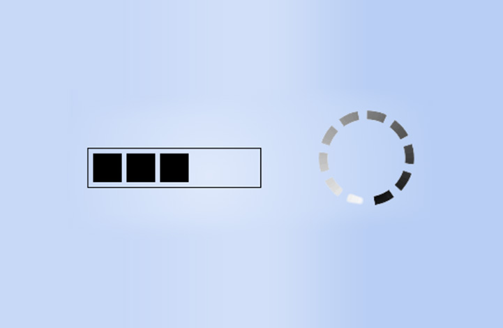
حالت انتظار
دکمه هایی به نام دکمه های spinner (چرخنده) وجود دارند که کارشان اعلام حالت loading یا انتظار است. می توانید در صورت نیاز از آن ها نیز استفاده کنید:
<!DOCTYPE html>
<html>
<head>
  <title>Bootstrap Example</title>
  <meta name="viewport" content="width=device-width, initial-scale=1">
  <link rel="stylesheet" href="https://maxcdn.bootstrapcdn.com/bootstrap/4.3.1/css/bootstrap.min.css">
  <script src="https://ajax.googleapis.com/ajax/libs/jquery/3.4.0/jquery.min.js"></script>
  <script src="https://cdnjs.cloudflare.com/ajax/libs/popper.js/1.14.7/umd/popper.min.js"></script>
  <script src="https://maxcdn.bootstrapcdn.com/bootstrap/4.3.1/js/bootstrap.min.js"></script>
</head>
<body>

<div class="container">
  <h2>Spinner Buttons</h2>
  <p>Add spinners to buttons:</p>

  <button class="btn btn-primary">
    <span class="spinner-border spinner-border-sm"></span>
  </button>

  <button class="btn btn-primary">
    <span class="spinner-border spinner-border-sm"></span>
    Loading..
  </button>

  <button class="btn btn-primary" disabled>
    <span class="spinner-border spinner-border-sm"></span>
    Loading..
  </button>

  <button class="btn btn-primary" disabled>
    <span class="spinner-grow spinner-grow-sm"></span>
    Loading..
  </button>
</div>

</body>
</html>
البته در آینده به طور جداگانه درباره این دکمه ها صحبت خواهیم کرد و فعلا به همین قدر بسنده می کنیم. امیدوارم از این قسمت لذت برده باشید. در درس های بعدی مجموعه آموزش Bootstrap 4 همراه ما باشید.
ترتیبی که روکسو برای مطالعهی دروس سری آموزش Bootstrap
توصیه میکند:

دورههای آموزشی مرتبط

مقالات مرتبط
17 اردیبهشت 1401
15 اردیبهشت 1401
11 بهمن 1400
07 اردیبهشت 1400
09 مرداد 1399
آخرین سوالات کاربران
alisadinm90 در 3 سال قبل پرسیده:
alidniry در 3 سال قبل پرسیده:
sepehr_sedigh در 3 سال قبل پرسیده:
fatehin در 3 سال قبل پرسیده:
amir4784 در 3 سال قبل پرسیده:
ما را دنبال کنید


در این قسمت، به پرسشهای تخصصی شما دربارهی محتوای مقاله پاسخ داده نمیشود. سوالات خود را اینجا بپرسید.
در این قسمت، به پرسشهای تخصصی شما دربارهی محتوای مقاله پاسخ داده نمیشود. سوالات خود را اینجا بپرسید.